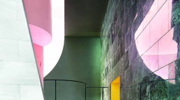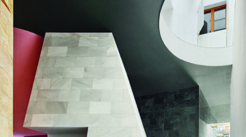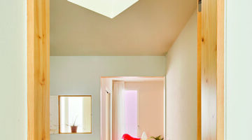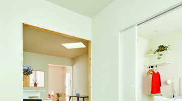
Block 0704

0

Block 0704

Mismatches
Financing
Promotion and production
Ownership and tenure

Main objectives of the project

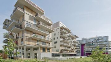
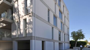
Block 0704 presents a new type of urban housing that attempts to challenge conventional architectural typologies of the apartment block.

Date

  • 2013: Construction

Stakeholders

  • Architect: Christos Christodoulou
  • Architect: Marios Christodoulides

Location

Continent: Europe
City: Geri
Country/Region: Cyprus

Description

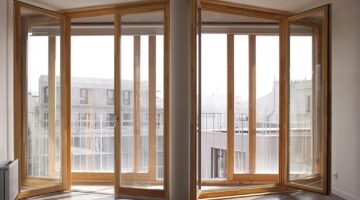
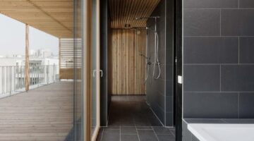
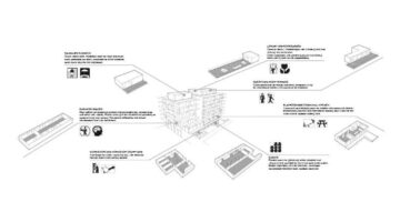
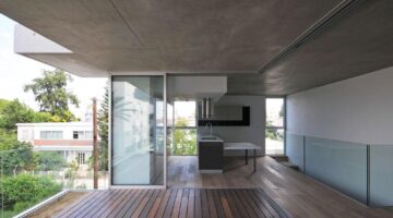
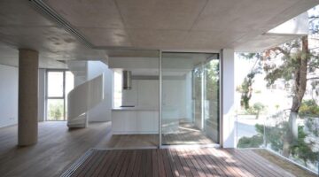
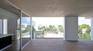
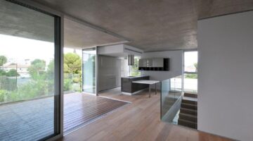
The block can be reinterpreted as a collection of ‘suburban residences’ that include two levels of spaces offering a separation of common areas and private spaces, a more immediate and effective relationship with the outside, a relatively large covered outdoor area, and the use of natural elements as deciduous trees to moderate the microclimate of each space. The relationship to the street becomes secondary with the arrangement of the spaces suggesting a more introverted experience that also encourages the modern dwellers to maximize use of the space and the relationship between indoors and outdoors. The traditional protruding verandas of the typical apartment block are reintegrated into the main mass of the building becoming an integral part of the interior/exterior spatial experience, both visually and functionally. Consequently the apartments attempt to satisfy contemporary desires which require flexibility, privacy, and a more inclusive relationship with the outdoors.
The area is relatively densely populated and characterized mostly by large residences, as well as a small number of apartment blocks, and full-grown vegetation offering shade during the summer months. It offers the benefits of a small and quiet neighborhood, with the convenience of being within walking distance to the city center.

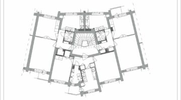
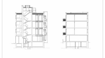
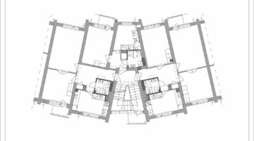
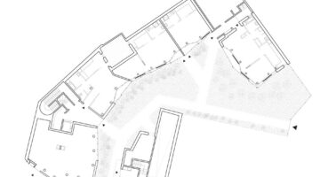
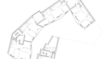
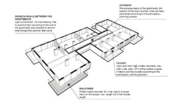
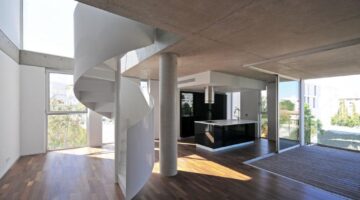
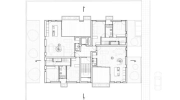
Block 0704 includes eight apartments, four two bedroom units and four three bedroom units. The units are arranged in two levels, with the bedrooms being on a different level from the living and kitchen areas. The sleeping areas of the smaller units are on the lower level while in the larger units they are situated on the upper level.

The building was designed to reduce the need for mechanical support in creating a comfortable environment as much as possible. All apartments are two level with double height spaces and are located at the four corners of the block. Daylight enters the interior spaces from two directions and at both levels.
Also cross ventilation for cooling becomes much more effective. To allow for direct sunlight in all spaces at some point during the day, especially during the winter months, all the units have controlled openings facing either east, south, and/or west. The deep verandas facing east and west receive plenty of sunlight but prevent direct sunlight from reaching the large sliding glass doors and interior spaces during the hot summer months.

All exterior spaces are covered except the cantilevered sections of the balconies that have provisions for trees. These trees can act as a brise-soleil regulating the micro climate of the immediate covered spaces, and also of the interior spaces. The outdoor covered areas for each apartment are very generous and are in direct relationship with the interior spaces. This makes them useable at all times of the day, and for the greater part of the year.

The plot size is 669 sq.m. The interior spaces are 936 sq.m. There is an additional 316 sq.m. of covered areas. The three bedroom apartments are 150 sq.m. and the two bedroom 120 sq.m.
Apartment Building in Pagkrati

0

Apartment Building in Pagkrati

Mismatches
Financing
Promotion and production
Ownership and tenure

Main objectives of the project

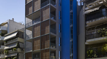
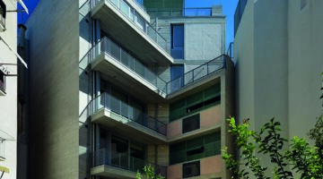
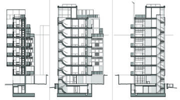
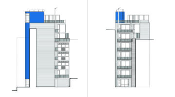
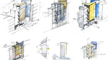
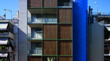
The six- storey apartment building attempts to redefine the expression of a multi-unit housing building and its relationship with the existing, densely populated, urban fabric of Athens. At the same time, it is a new bioclimatic approach of organizing the front of the building block to the street and the public space of the city.

Date

  • 2019: Construction

Stakeholders

  • Architect: Demetrios Issaias
  • Architect: Tassis Papaioannou

Location

Continent: Europe
City: Atene
Country/Region: Athens, Greece

Description

After the Second World War, Greek cities developed under a particular entrepreneurial activity based on the activities of a small-scale construction industry and land acquisition. The key economic mechanism used was what is known in Greek as ‘antiparochi’, a land allowance, quid-pro-quo informal agreement between landowners and contractors, and the building model that fit the above was the multi-storey apartment building, namely the “polykatoikia” type. In order for this to work and to be profitable, plot sizes had to be of a certain dimension. This meant that many smaller plots have remained until today unbuilt, unused and abandoned, with small structures as traces and ruins of the past.

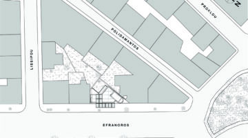
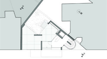
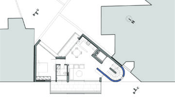
The plot, of just 119m2 and with an almost triangular shape, is what was left unbuilt in the block, defined by a partially demolished, pre-war three-storey building. If this plot was uneconomical and unprofitable for the typical contractor to develop, it consisted of a particular challenge for the design of a new building of small housing units, which would have to evolve in height.
A dense, homogenous urban form of tall apartment buildings characterizes the neighborhood. The building operates as an infill to the block, completing the continuous urban, street façades, while a sense of ‘hovering’ is created by leaving the entrance level open and permeable, creating a pilotis with a courtyard at the back of the plot. This courtyard visually connects the busy street with the small, uncovered spaces at the heart of the block.

The tubular-shaped staircase defines and differentiates the building from the adjacent “polykatoikia” and, like swivel, signifies the vertical circulation. Moreover, it liberates building mass from the party wall, expressing and transferring to the street the dynamic geometry of the triangular plot.

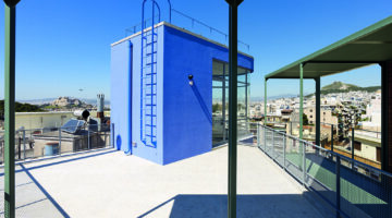
A particularly important strategic decision, which serves the environmental and bioclimatic design, is the creation of a layered façade, from the second level to the top of the building. At the top floor, the façade folds and turns into a pergola of a generous roof garden offered to all inhabitants to enjoy the spectacular, panoramic view to the city and its two most characteristic landmarks: the Parthenon and Lycabettus Hill.
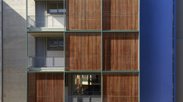
The building is constructed of reinforced concrete, left un-plastered and in its natural color, both externally and internally. There is also extensive use of metal elements, in secondary structural elements, window frames and various details. The bioclimatic performance and energy output of the building was of particular concern with natural light and ventilation for all spaces and the use of renewable energy sustainable systems. The wooden panels are a key characteristic of the morphology and materiality of the project. Apart from creating double façade for solar protection and management, they operate as filter for the noise and the disturbance of the city, forming private semi-outdoor spaces. The panels are movable and therefore introduce an element of constant and dynamic variability through time.

Finally, the project explored the organic relationship between architecture and art, with the introduction of carefully selected forms from the work of Greek painter Alekos Fassianos that define different edges of the project. The architects also designed most furniture and internal equipment, made of plywood boards and timber in natural color.

Serpentine House Refurbishment

0

Serpentine House Refurbishment

Policies and regulations
Financing
Promotion and production
Ownership and tenure

Main objectives of the project

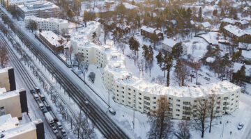
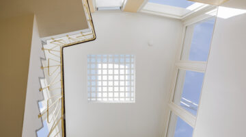
The Serpentine House is one of the best-known residential developments from the post-war years in Finland and listed by DOCOMOMO Finland as a significant example of modern architecture. The aim of the refurbishment project has been to preserve and enhance the building´s architectural values while solving multiple technical and functional issues.

Date

  • 2020: Construction

Stakeholders

  • Architect: Marica Schalin
  • Architect: Kristina Karlsson
  • Architect: Mona Schalin

Location

Continent: Europe
City: Helsinki
Country/Region: Finland

Description

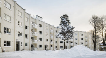
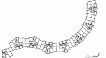
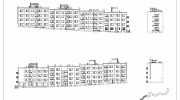
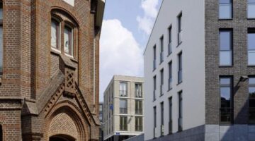
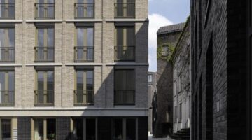
The long, undulating, four storey tenant block, with its 189 rental flats, is situated on a hilly site at the edge of an garden city area. The courtyards have been redesigned preserving the sylvan character.

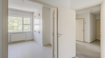
The flats consist mainly of two rooms, kitchenette and bathroom. They have been upgraded with special attention to bathrooms, fixtures and fittings. The original kitchen cabinets have been repaired when possible.
Common facilities have been refurbished.

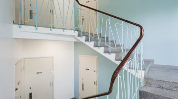
The roof slab has been replaced by a ventilated construction. The exterior rough plastering and balconies with their delicate railings have been reconstructed. Windows and balcony doors have been repaired and any details in poor condition have been replaced. The original colour scheme has been reconstructed in collaboration with a conservator, applying traditional paint methods.
The long road from preliminary condition surveys to successful completion of construction can be seen as a didactic example of a process with many stakeholders involved. Not least because of the specific challenges concerning the conservation of modern architecture.

By 2010, the exterior and the dwellings had long suffered from lack of funding for maintenance. Rejecting the initial renovation programme, based on purely technical and functional priorities, the building permit authorities demanded focus on architectural values. Eventually, the Serpentine House, both buildings and site, were protected in a detailed town plan.

Since the protection had established strict boundaries for intervention, preserving the original architectural, spatial and material characteristics clearly emerged as an objective shared by the client, the authorities and the design team, even as the task was to solve serious technical and structural problems and introduce functional improvements.

The implementation was planned in two stages, the first stage serving as a test lab for the methods and practices during the four years of construction.
The main improvement issues have been the technical performance of the roof and the external walls, built of brick and Betocel blocks. The balconies from a time when steel was scarce, have been rebuilt. The ventilation duct system has been renovated.

The Serpentine House has received publicity as a model for sustainable renovation - the original wooden windows and kitchen cupboards have been repaired with carpenters´skills, the natural ventilation has been improved, the tenants have been able to return to their flats after the construction, the common facilities and the courtyards have been improved.

The future lifespan of the 70 years old buildings has now been secured. The lasting features are the loadbearing structure, the building envelope and the floor plan, while roofing, ventilation, plastered and painted surfaces, fixtures, cupboards, windows etc. will require maintenance according to an appropriate plan. Fortunately, Helsinki City Housing Company has an expertise in dealing with the maintenance of a huge amount of buildings from the 20th century.

Can Travi - 85 dwellings for the eldery and public facilities

0

Can Travi - 85 dwellings for the eldery and public facilities

Policies and regulations
Financing
Urban Design
Ownership and tenure

Main objectives of the project

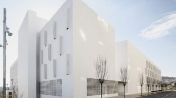
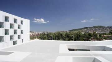
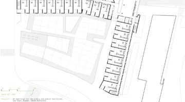
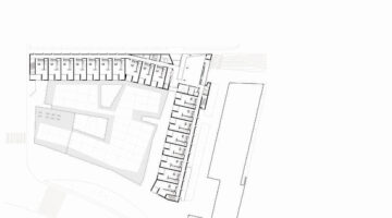
The site is on Tibidabo hillside close to the edge of Barcelona. It's a 3.500m2 trapezoidal shape with a 3,5 meters gap on the short axis and mainly horitzontal on the long one. It has an excelent south-east orientation and it has some impressive views over Barcelona.

Date

  • 2009: Construction

Stakeholders

  • Architect: Cristina Garcia Nafria
  • Architect: Gines Egea Viñas
  • Architect: Sergi Serrat Guillen

Location

Continent: Europe
City: Barcelona
Country/Region: Spain

Description

The project has to solve a program of 6500m2 of social housing with 85 dwelings for eldery people and parking space for 28 cars. There are also 2000m2 of public facilities with a civical center.

Main strategies

(1) Best orientation. All of the dwelings benefit from South-East orientation. That means a great comfort for the inhabitants and a high degree of energy saving both in illumination and climatizacion of the dwellings

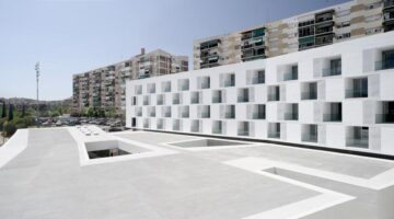
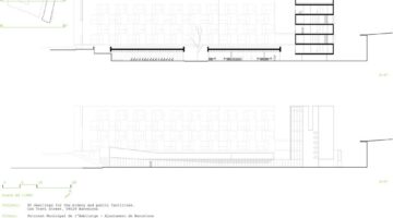
(2) Housing units bars are concentrated on the north perimeter of the plot so the most of the land it's available to build the civical center while keeping both best orientation and views. The building keeps a low profile of 3 stories to integrate into the neighborhood

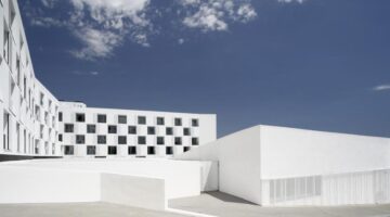
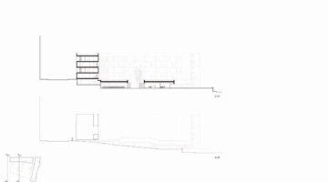
(3) Topographical gap is solved with the parking and the civical centrer volume. Its roof is understood as a fifth façade of the building. It's treated with a painted tennis-quick finish similar to the sportive pavement used in the urbanization of the near park. It's completely open on ground floor showing its public character to the street acting as a true activity generator for the surroundings
(4) Mix of passive and active system to ensure a good climatic behavior and energysaving strategies, such as good south east orientation for dwellings, deep terraces that protects users from excessive sunlight radiation in summer but act as energy space collectors on winter, increased insulation on roofs, water management strategies and a central heating and hot water production system with solar contribution (35% of CO2 emission savings)
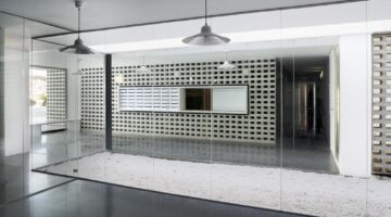
(5) Economic containment. White and void are the only materials used for the composition of the facade. Taking advantage of Mediterranean benevolent climatic conditions terraces function as condensers of activity enhancing the sense of community of the users. It is the place where domestic and civic activities occurs and are shown to the city. They are like the central courtyard of the houses of the Algerian Kashba but placed in a vertical plane. The size (2,5x2,5x2,5) of those voids goes beyond the scale of housing units and speaks on a level closer to the scale of the building and the city. The set of all those different actions and activities are integrated into the building volume due to the inner position of the terrace. The repetition of the void turns the facade into a chess texture. The white background unifies it all as does the snow fallen on the landscape.

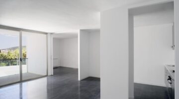
(6) Housing units are the core of the system. Unit plan layout creates the longest interior diagonals possible so the space is perceived in its maximal length. Services areas are placed

on the north side (corridor, maintenance, bath, kitchen) while relation areas (living, bedroom, terraces) are faced to south.

Hessenberg

0

Hessenberg

Policies and regulations
Financing
Urban Design
Ownership and tenure

Main objectives of the project

The preparation of an urban plan and design for the public space of an unique new housing area in the historic inner city of Nijmegen, by which about 190 new residences have been realised.

Date

  • 2011: Construction

Stakeholders

  • Architect: Esther van der Heijden
  • Architect: Nike van Keulen
  • Architect: Frank Meijer
  • Architect: Theo van de Beek
  • Architect: Rick Wessels
  • Architect: Hans van der Heijden
  • Architect: Filip Delanghe
  • Architect: Jan Verrelst

Location

Continent: Europe
Country/Region: Netherlands, Nijmegen

Description

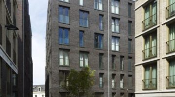
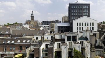
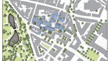
A unique new housing area has been realised in the historic inner city of Nijmegen, by which about 190 new residences and 2 parking garages have been realised.
MTD landscape and urban planners was commissioned by the Municipality of Nijmegen to draw up an urban design plan and development plan for the public space.
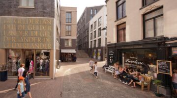
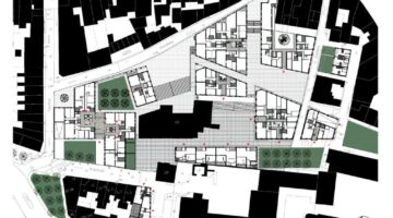
The urban design plan can be described as a finely-grained pattern of compact residential blocks, streets, and squares, directly related to the former identity of the area as an ‘immunity’. The public space has a plain design, in which the different squares are considered as focal point for activities in the area.
compact housing area between Hezelstraat and Kronenburgpark
A unique new housing area has been realised on the former grounds of the Gelderlander site in the inner city of Nijmegen; the inner urban fabric has been repaired and about 190 new residences have been realised.
In 2004 the Municipality of Nijmegen made a fresh start with the project, in which the ambition was specifically expressed to preserve and enhance the culture-historical patterns and elements. MTD landscape and urban planners was firstly commissioned to develop an urban development outline using an interdisciplinary team. Subsequent to this preliminary phase, AWG architecten and MTD landscape and urban planners were commissioned by Heijmans Project Development to draw up an urban design plan and development plan for the public space.
The urban design plan for the Hessenberg can be described as a finely-grained pattern of compact residential blocks, streets, alleyways, inner courtyards and squares; this pattern is directly related to the historical pattern of streets which is present here and refers to the former identity of the area as an ‘immunity’.
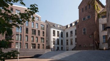
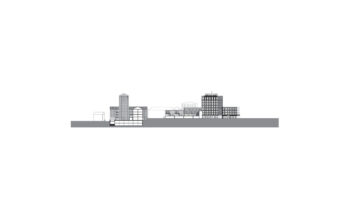
The height difference in the planning area of approximately 4 metres is accentuated and has been designed in 3 individual surface levels; the lowest level along the Hessenberg, an intermediate level and lastly the level of the historical built-up area of the Orphanage. There s a playful mix between the building mass and these surface levels, in which two parking garages have been fitted. Along the Hessenberg this creates a plinth for public functions. The monumental Orphanage is perceived in the urban design plan as a crystallization point of the new buildings; the building will be extended with new wings and a higher residential tower.
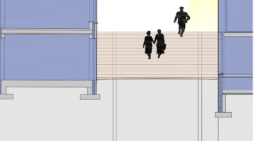
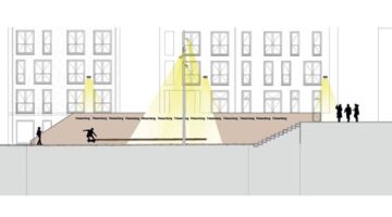
The public space has a plain design, in which the current difference in height from east to west is bridged by way of ramps, and for the north to south direction by way of stairs. The public area surrounding the Orphanage has a convent-like atmosphere paved in a natural stone and enclosed by walled, semi-public gardens. The entrance square and the heart of the housing area with its broad natural stone stairs to the monumental building are in front of the Orphanage along the Hessenberg. The square is considered a focal point for activities in the area and a natural theatre and meeting place.
At the uppermost surface level there s a second square with a quietened character. This is where a work of art by Marinus Boezem will be placed; this ‘shadow of light’ will also act as a seating object.
In the project the stormwater is infiltrated in the soil and by peak drains the stairs are introduced as a place where you can experience this. In the stairs little gutters and water wells are introduced to create experiental of the water transport.

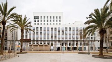
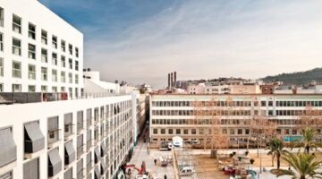
127 Social Dwellings Building

0

127 Social Dwellings Building

Policies and regulations
Urban Design
Promotion and production
Ownership and tenure

Main objectives of the project

Mediating between both, past and present, craftsmanship and technology.

Date

  • 2011: Construction

Stakeholders

  • Architect: Víctor Setoain
  • Architect: Neus Lacomba
  • Architect: Eduard Bru

Location

Continent: Europe
City: Barcelona
Country/Region: Spain

Description

The site was a bastion and a door in the third city wall in Barcelona. After this, it became a hospital, a prison, a square and swimming pool.

The site is now a inhabited door between the Eixample and the Raval. The project mediates between both, between past and present, between craftsmanship and technology.

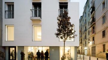
The program is social housing and dwellings for the elderly people. There is also a passage and a communal courtyard, in the lower floors public facilities are located.

The volume accomplishes two different urban scales:

First, that of the Raval district:

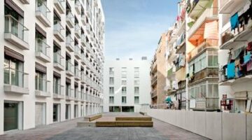
•The project creates a small square, which provides a better natural lighting and ventilation to narrow streets.

•The project incorporates the traditional balcony and blind, which gradually filter a relationship of the public and private domains.

And second, the building achieves the urban height of the Eixample.

Design has pursued sustainable principles, searching for energetic self-sufficiency and passive regulation of the interior temperature according to the following elements:

•Optimized size of overtures in main façades (SW and NE), providing mobile sun protection (roll-up blinds).

•In order to reinforce solar protection in over-exposed areas (above 6th level), balconies incorporate in addition fixed structures for vegetal species, reducing solar incidence over the window.

Passive and active elements configure a building of high energetic efficiency, from the architectural design of the façade to the installation of air conditioning. The building approaches self-sufficiency, as it is currently demanded.

The selection of materials and construction details has been done in consideration of their life span cycle. Low incorporated energy, durability and scarce or non-existent maintenance have become criteria for the selection of materials. Amongst main materials:

•Natural wood with autoclave treatment, without varnish, for banisters and benches.

•Terrazzo pavements.

•Lime stucco without paint for all façades.
Low incorporated energy materials.

All dwellings provide crossed ventilation. Size, location and practicability of overtures allow crossed ventilation according to their inhabitants’ needs, by controlling it. Roll-up blinds are a key element in the strategy, protecting from direct solar radiation while allowing natural ventilation.

Balconies are designed for obtaining a good natural lighting for rooms as well as for avoiding excessive solar radiation along.

Greenery in the interior courtyard provides a garden inside built environment, diminishing the heat during the warmest months of the year.

Experimental Public Housing

0

Experimental Public Housing

Policies and regulations
Financing
Urban Design
Ownership and tenure

Main objectives of the project

Our time strives for the environmental quality of buildings and their energy frugality. In a social perspective of housing history, such collective pleas have lead to creating housing schemes, garden cities and even Bastides. In our turn, aware of this issue, which architectural expression will our generation convey?

Date

  • 2013: Rehabilitación

Stakeholders

  • Architect: Marc Reynaud
  • Architect: Armand Nouvet
  • Architect: Thibaud Babled

Location

Continent: Europe
City: Paris
Country/Region: France

Description

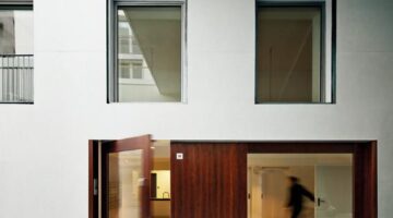
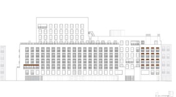
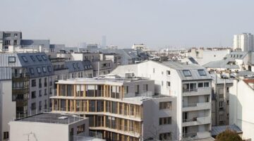
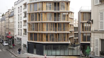
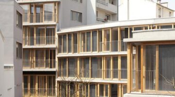
This small experimental building was an opportunity to look into sustainable construction. Very low energy consumption goals are achieved exclusively through architectural means. That is, without relying on technological accessories, but using definitely low-tech displays and devices (orientation, windows, piers, verandas, curtains) and involving inhabitants gestures and use of their home. Therefore the façade geometry is ever changing, animated by use, weather and glass reflexions. The global architectural design proposes some evidence: it favours a straight expression of its construction.
The project is part of the urban redevelopment of the Frequel-
Fontarabie block in North-East Paris. It was to become a pilot operation for the newly voted Plan Climat de la Ville de Paris, which asked for a maximum energy expenditure of 50 kWh/m2/year. To meet this target, the architectural team decided to rely solely on architecture on a site that, although very dense, offered to take advantage of sun.
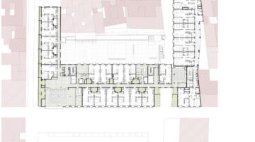
The new volumes are adjusted to the end walls of the next buildings to reduce shadows. They draw a ribbon garden shared by residents and opening onto the new public garden, constructions getting lower as you penetrate the block.
The three entrance-halls open directly onto this courtyard. Each one is open to all residents: respectively giving access to the underground garage, the letterboxes or the bike storage room.
The bearing structure is minimized to a post-slab system using less concrete, offering more flexibility in flat layouts and enabling future conversion of the building. The resulting colonnade, allows the sunlight deep into the flats.
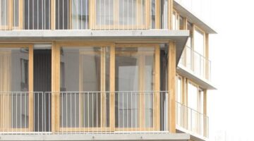
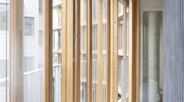
Limited use of concrete on facades favours a larger use of renewable materials. Custom-made wood framed sliding windows give a very precise quality to both exterior and interiors.
Apartments are designed so as to maximise natural light and ventilation, most bathrooms opening onto a window. Inhabitants are given greater control over temperatures in any season.
The double envelop sets an acoustic and bioclimatic device reinforced by Trombe walls. Sunlight penetrates the first extra-clear glass envelope and hits the wavy wall, whose dark matt surface turns light into heat. To stop this natural heating, inhabitants simply roll down the blind facing the wall and open the exterior windows.
Size of the site :944 m2
Size of the building :1960 m2 (GFA)

Co-Housing Vienna

0

Co-Housing Vienna

Policies and regulations
Financing
Urban Design
Promotion and production

Main objectives of the project

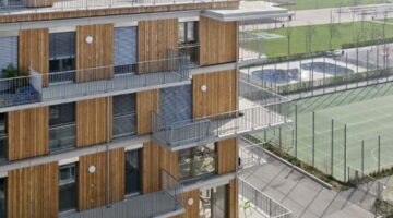
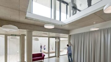
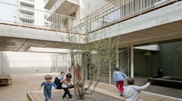
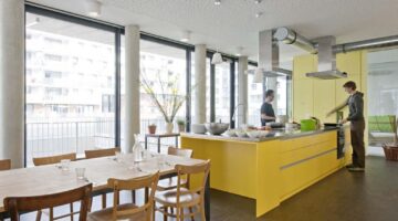
In the center of Vienna, in the so called Nordbahnhofgelände, an incubator of sustainable urban living is created: the Co-housing Vienna - Wohnprojekt Wien. The Co-housing project was finalised on December 2013, it consists of 39 apartment units, and it is located in an attractive newly developed, urban area.

Date

  • 2013: Construction

Stakeholders

  • Architect: Markus Pendlmayr
  • Architect: Markus Zilker
  • Architect: Katharina Bayer

Location

Continent: Europe
City: Vienna
Country/Region: Austria

Description

The heart of the project is a self-organised community and the shared dream to live together in the city in a sustainable, collaborative and open-minded way. This way started from the very beginning with the participatory planning process of the communal spaces and the individual apartment units, continued with the creation of an alternative mobility system, a communal garden for the neighborhood, and ended up with the communal ownership of the building, in other words with active participation during all the levels of the projectŽs development.
One of the greatest challenges of the project was to achieve high individualisation inside the frames of community and to express it in terms of architectural design. Several communal spaces offer the possibility for exchange and communication while the individual apartment units can be spaces for retreat. The communicative architecture of the building promotes free and spontaneous encounters. The apartments and the common spaces were developed and designed from the very begining under the cooperation of the architects and the residents, allowing in this way alternative modes of living and flexible uses. The common spaces consist of the guest apartments, a sauna on the roof and on the lower floors, a communal kitchen, workshops and event rooms including a playroom for children. The project is hosting different models of living and working, multiple generations and diverse cultures under the same roof. The building is planned with almost passive-house standards and consists of a massive construction body with a wooden facade.

Size of the site: 4.783m²

Size of the building: 5.300m²
The energy efficiency is supported by a mechanical ventilation system with temperature controlled through groundwater and a photovoltaic installation on the rooftop.

At the end the Co-housing Vienna is a model for a new way of living in the city of Vienna.

110 ROOMS. Collective Housing

0

110 ROOMS. Collective Housing

Policies and regulations
Promotion and production
Ownership and tenure

Main objectives of the project

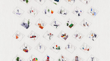
The collective housing contains a system of 110 rooms, which can be used as desired. Answering to the client’s demand, each apartment can be expanded or reduced adding or subtracting rooms in order to answer to inhabitants needs. With that flexibility in mind, rooms are similar eliminating any type of spatial hierarchy and program predetermination.

Date

  • 2016: Rehabilitación

Stakeholders

  • Architect: Guillermo López Ibáñez
  • Architect: Alfredo Lérida Horta
  • Architect: Anna Puigjaner Barberá
  • Architect: María Charneco Llanos

Location

Continent: Europe
City: Barcelona
Country/Region: Spain

Description

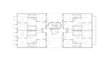
The building is designed as a system of similar rooms. So each apartment can be sized and programed depending on the need.

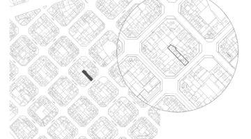
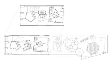
For the next years, each floor is divided as a set of 4 apartments of 5 rooms. Rooms are connected, no corridor is needed. A kitchenette is placed in the middle acting as the center, the other rooms will be used as bedrooms and livingrooms. This flexibility is able due to the position of bathrooms, where all installations are placed as points for supply. The interior patio is roofless allowing natural ventilation, an important factor for comfort and consume control.

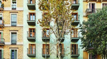
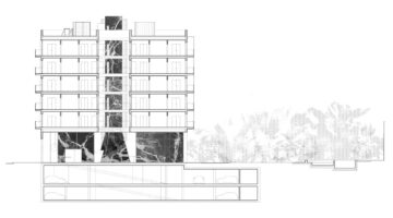
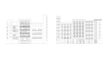
The ground floor refers to Eixample’s traditional halls where marbles and large spaces define the place of reception and representation. The facade as well searches to consolidate the traditional style of the area, where prevail opaque stucco walls with vertical openings and balconies.
This project is born from the radicalization of everything that seems to us valuable from Eixample’s typological tradition. Thus, floor plants are formalized following the distribution of equal (or almost equal) rooms that traditionally characterized late XIX C. housing in the area, and have modified their use throughout the decades without substantial changes. A rigid system that allows changing its use over time.

Something similar happens with the façade, where the traditional archetypal composition has simply been replicated to consolidate the preexistent: vertical openings, balconies and wood shutters. Zero invention, pure reproduction. The façade finishing is done with traditional lime stucco, which, as often happened, represents through its pattern the memory of its old inhabitants.

The ground floor recovers the popular language of old Eixample’s halls, where, through furniture and large habitable objects, the space was arranged to house different uses. Here, these furnitures are transformed into marble volumes in the middle of a large open space (where it literally rains allowing to understand the hall as an extension of the street)
The building structure is defined by a mixed system. In the ground floor a metallic structure forms each volume, and supports the building loads. The rest of the floors are supported by a reticular grid of concrete pillars and slabs, which define an order that allows future changes.

The construction system rationalizes costs and optimizes long-term use. Thus, the constructive solutions follow the tradition of the Eixample’s neighborhood, where the building is placed. Solutions which have been already used during decades there, proofing to be successful and efficient.

At the exterior façade, a ceramic layer with thermal insulation is suspended covering completely the structure and the inner enclosure. This sheet defines a continuous base for the finishing coating, which is a two-color lime stucco following the traditional neighborhood façade type. The exterior carpentry is done with laminated pine wood, complemented with traditional wood shutters for sun and ventilation regulation, increasing the building’s energetic efficiency.

In the interior, all the partitions are done with dry wall systems, allowing easy future changes in room connections.

Nowy Nikiszowiec Affordable Housing Settlement

0

Nowy Nikiszowiec Affordable Housing Settlement

Mismatches
Promotion and production
Ownership and tenure

Main objectives of the project

Nowy Nikiszowiec Housing Settlement is an unprecedented example on the Polish housing market. This is mainly due to nature of the investment. It is the first Polish state-funded housing complex with flats intended for rent only. It is a step towards large part of customers who can't afford a mortgage and are looking for a place to live in decent conditions

Date

  • 2021: Construction

Stakeholders

  • Architect: Stanisław Tomaszewski
  • Architect: Paweł Gumuła
  • Architect: Karolina Bielonko
  • Architect: Katarzyna Kłaczek
  • Architect: Weronika Misiak
  • Architect: Aleksandra Zubelewicz-Lada
  • Architect: Michał Tatjewski
  • Architect: Maciej Kowalczyk
  • Architect: Wojciech Conder
  • Architect: Aleksander Drzewiecki

Location

Continent: Europe
Country/Region: Poland

Description

Nowy Nikiszowiec is a complex of multi-family buildings located in the iconic Nikiszowiec district of Katowice. The place is famous for its unique on a global scale, well-preserved housing estate from the beginning of the 20th century, intended for employees of the nearby Giesche mine. The newly created housing estate refers directly to the original idea of spatial arrangement, which is its historical counterpart.

The difference is the purpose of the new investment. The project is being developed not with mine employees in mind, but with a large social group of middle-class people looking for a flat but unable to get a mortgage to buy it. To meet this need, the Polish government launched a program called "Apartment for Development", in which it finances the construction of housing estates with flats for rent. The Nowy Nikiszowiec estate is the first case of this type on a larger scale
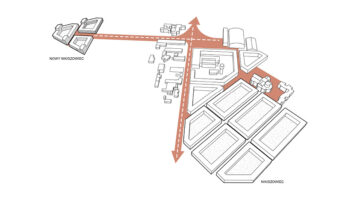
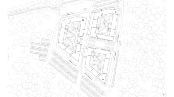
The Nikiszowiec district in the background of the city of Katowice resembles an island divided by forest areas and numerous expressways connecting the cities of Silesia. The designed housing estate has similar characteristics. It is surrounded on three sides by a forest, while to the east it borders the mine area and the historic estate from the beginning of the 20th century.

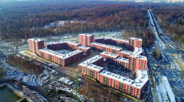
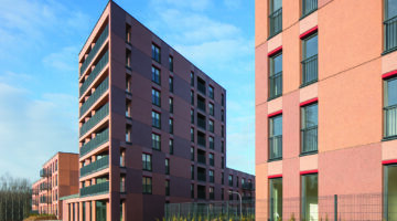
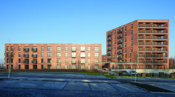
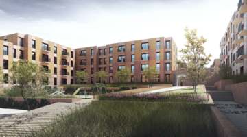
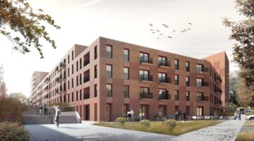
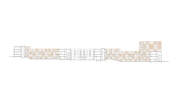
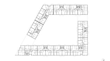
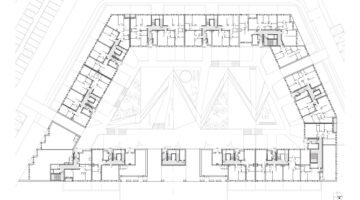
It consists of three buildings in a block shaped development. At the same time, it has many distinctive features, among which the brick-colored façades, terraced courtyards and the central square which is the core of the estate and future meeting center for residents. The buildings will contain 513 turnkey apartments for rent as part of the government program piloted by Polish Fund for Real Estate Development.

The main concern was to provide a scale-friendly space for residents with numerous references to the most interesting elements of the historic neighboring estate. The priority was to create an open space conducive to the integration of the local community, as opposed to the often fenced housing estates implemented by private developers.
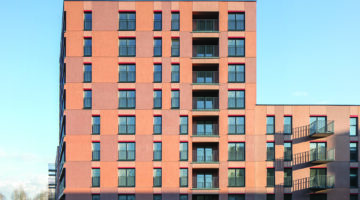
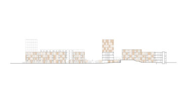
The buildings are designed in a reinforced concrete skeleton structure. The predominant height is four storeys. The exceptions are eight-storey dominants at the corners of the buildings. In addition, the inclined area causes the buildings to gradually lower, creating a terraced shape of solids.

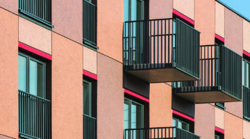
One of the most characteristic features of Nowy Nikiszowiec is the homogeneous facade, which has the same expression both outside and in the courtyards. Its colors, like many other features, were taken from the surrounding context where brick dominates. Due to the economic aspect the brick was replaced by a noble plaster with an admixture of shiny mica flakes. The façade is characterized by inter-window spaces shimmering in several brick shades, creating a characteristic rusty checkerboard. It is a reference to the composition of different shades of the brick facade, only applied on a larger scale. As a result, a unique effect was created that confusingly resembles facades made of prefabricated concrete facings.

An equally important element of this investment is the partial use of prefabricated concrete elements, such as stair flights, staircase landings and balcony slabs