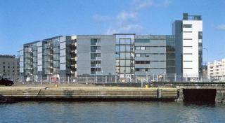
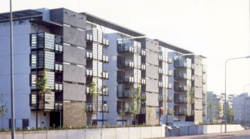
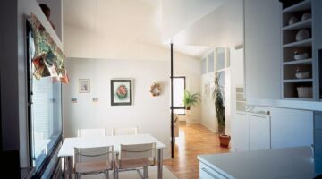
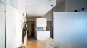
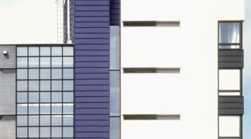
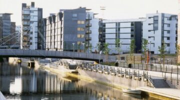
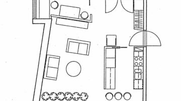
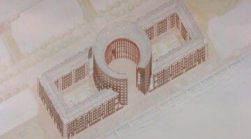
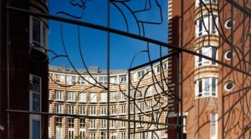
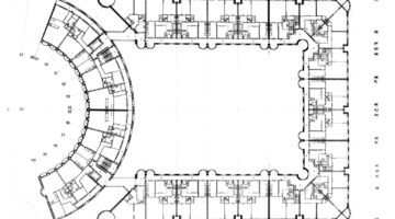
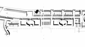
Shipboy Housing
Main objectives of the project
Date
- 1995: Construction
Stakeholders
- Architect: Ritva Mannersuo
- Architect: Pekka Helin
Location
City: Helsinki
Country/Region: Finland, Helsinki


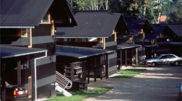
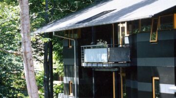
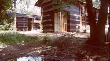
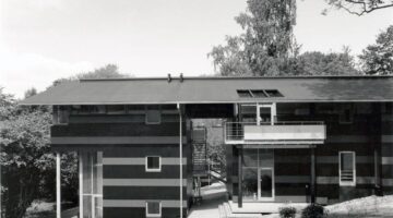
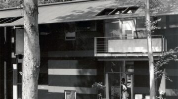
The main objectives of the 1989 housing scheme competition near Horsholm's historical town center, involving Vandkunsten and five other architectural offices, centered on seamlessly integrating with the extraordinary natural setting. The design aimed to create a paradisiacal forest atmosphere within an urban housing area while addressing the challenge of inserting itself as a transitional wedge between different housing types to the east and west. Emphasizing respect for the surroundings and the site's unique ambiguities, the project sought a harmonious blend of inspiration, context sensitivity, and thoughtful urban planning.
In the spring of 1989, six architectural offices, including Vandkunsten were invited to participate in a design competition for a housing scheme on an extraordinary site near the historical town center of Horsholm.
When the treetops and low foliage block out the view of the surrounding properties, and one stands in one of the small clearings, and almost paradisiacal forest atmosphere can be experienced, one that is rarely found so close to an urban housing area. To be in an almost untouched natural setting, so close to Horsholms center is one of the subtle ambiguities of this place.
Another ambiguity or perhaps even a double entendre arises from the existing buildings to the east and west of the site. This exclusive property forms a transition between the high-lying, old villas on large tracts to the east, and the very distinctive housing blocks to the west. This situations, in which the new scheme is forced to insert itself as a wedge between two quite different housing types, was a decisive factor in planning the scheme.
Aside from the inspiration provided by the atmosphere of the place, and the respect for the surrounding housing, a number of circumstances had an influence on disposition of the main plan.
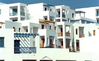
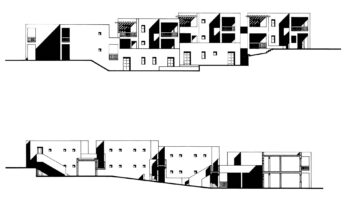
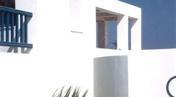
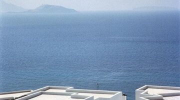
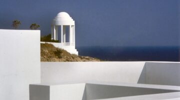
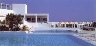
Diadalos, a tourist village on Kos Island, harmoniously integrates with the Aegean landscape through its adaptive architecture. Divided into private, communal, and staff zones, the design prioritizes privacy, sea views, and respect for the site's topography. By eschewing repetitive hotel patterns, it aims to authentically capture the spirit of Greek Island architecture.
Diadalos is a tourist village designed for 1000 people and located on Kos, one of the Greek Dodecanese Islands. The village is built on a plateau at 90m. elevation overlooking the sea to the south. The main design idea was the creation of an architecture that is well adapted to the physical and cultural identity of the place. Specifically, this architecture would take advantage adapted to the physical and cultural identity of the place. Specifically, this architecture would take advantage of the landscape, respect local topography and climate, and draw inspiration from the spatial qualities of the settlements in the Aegean. With the use of the simplest formal devices and contemporary means of construction, the design seeks to recapture the spirit of the architecture of the Greek Islands, and to bring out the quality of the Aegean landscape without resorting to the use of borrowed features and figures. This design approach also helps to transform the repetitive architectural patterns that are often associated with the architecture of hotels. The resort is divided into three zones.
The first provides private accommodation, the second consist of communal facilities while the third is that of the staff accommodation. There are two residential types, namely single-bedroom or two-bedroom family units. All units have a private verandah. Rather than opt for free standing pavilions, units are linked to form single or double-storey terraces of varying configurations. The terraces define an irregular pattern of narrow pedestrian streets, covered walkways and enclosed gardens. The principles governing the layout include the provision of privacy, the creation of views to the sea and respect for the slope, contours and orientation of the site. The resulting variety of spatial relationships gives a distinct identity to each point of the arrangement.
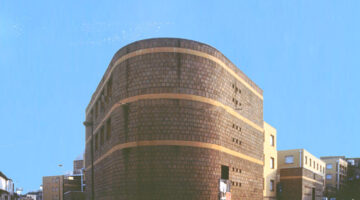
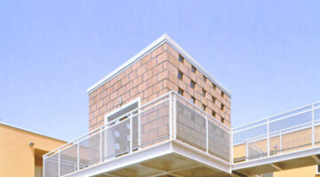
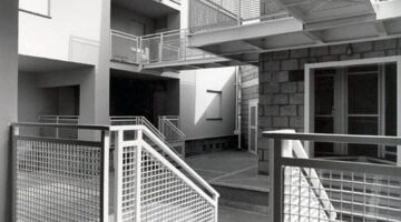
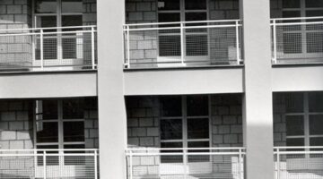
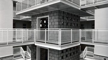
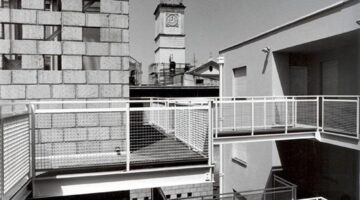
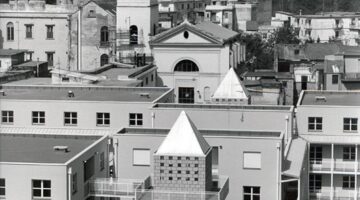
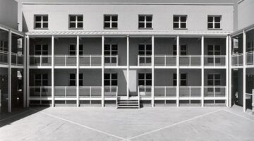
The Marianella project (1983-1988) in Naples focused on rebuilding post-1980 earthquake. Objectives involved transforming a serial-type plan into dynamic urban interventions, creating three-floor residential blocks with courtyards. Using the French prefabrication system, it successfully addressed both housing needs and the reintegration of the outskirts.
The idea behind the project for a block in Marianella, a center of the outskirts of Naples, consists in making react a type-morphological plan of serial nature, with the outline of the area, considered as a perimeter on which are projected different conditions of the context. In contact with such a outline, which is configured as an active margin, the model undergoes a series of subtractions that are proposed as architectural variations of the plan. It is subtracted so to the repetition inherent in the initial model by purchasing a geometric and plastic variability, which results in an increase of the complexity of the urban intervention.
The intervention for sixtyfour accommodation in Marianella, in the metropolitan area of Naples, was designed in 1983 and completed in 1988 after the earthquake of 1980, an event that ruined not only the historical center of the city but also the peripheral expansions. The project was thought both to be to rebuild a number of destroyed houses and to reconnect separate parts of the peripheral tissue. A urban fabric in which was spread a courtyard typology, which gave rise to complex residential units designed to accommodate families of farmers in the Neapolitan countryside. The project has taken this typological matrix, obviously transformed, proposing a series of residential blocks of three floors, organized around two types of courtyards. On the larger courtyards overlook houses with continuous balconies supported by iron pillars; the smallest include the stairs towers which, through four gangways, distribute eight apartments for each floor. The residential blocks are made with the French prefabrication system banches e tables and then plastered. The stairs have an iron structure covered with tuff. Also the portals of entry to the courts are made with tuff.
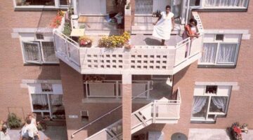
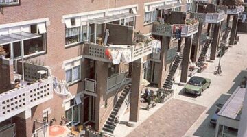
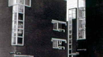
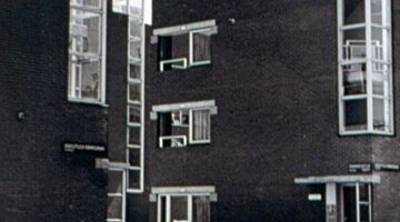
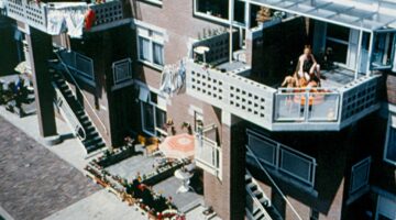
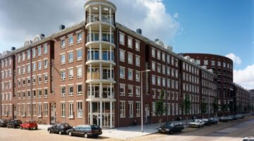
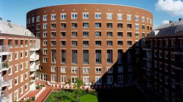
The primary objectives of the Haarlemmer Houttuinen Housing project in Amsterdam were to establish a lively and community-focused environment. Architect Hertzberger aimed to create an intimate, pedestrian-friendly street, limiting access to residents' vehicles. The design prioritized fine-tuned scale, fostering a sense of community, and incorporating distinctive architectural elements to enhance the unique character of the residential quarter.
The Haarlemmer Houttuinen Housing in Amsterdam is squeezed between a busy main road and railway to the north and Haarlemmerstraat to the south. The north block was built by Hertzberger, the one to the south by the architects Van Herk & Nagelkerke. The two blocks are separated by a pedestrian street connected to Haarlemmerstraat by two gateway buildings also designed by Van Herk.
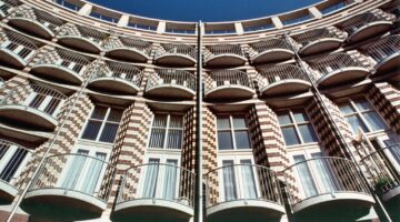
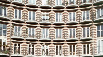
Hertzberger s housing block has projecting piers with balconies that give rhythm to the street. Each pier marks the entrance to four maisonettes and supports the balcony of the upper two. All entrances to the dwellings are off the street and balconies and gardens overlook it. Fine-tuning of scale is
achieved by tiles in the centre of the lintels and the granite pads supporting them, and by the different sized square windows which syncopate rhythms and let in light along the ceilings where window heads have been kept closed to give intimacy within.
Hertzberger wanted the new street to be a lively community area. The street is accessible only to residents cars and delivery vehicles. With the street closed to general motorised traffic and measuring only 7 metres in width, an unusually narrow profile by modern standards, a situation is created reminiscent of the old city. Street furnishings such as lights, bicycle racks, low fencing and public benches are distributed in such a way that the passage of traffic is obstructed with only a few parked cars. Some trees are planted to form a centre halfway between the two street sections. The lower maisonettes can be entered from their tiny gardens in the street, while the upper units can be reached by external stairs to a shared landing at first floor level, where the front doors are. While the extended block on the north side of the street provides shelter from the busy main road and railway behind it, the south-side block is one storey lower to allow the sun to shine in the street. In this respect, the scheme reinstates the original function of the street as a place where local residents can meet. Streets which no longer serve exclusively as traffic thoroughfares are increasingly seen on the new housing estates and in urban renewal projects. The interests of pedestrians are being taken into consideration, and with the recognition of the woonerf as a street space in a residential area where pedestrians enjoy legal protection against traffic, they are slowly regaining their rightful ground. The decision to reserve a strip 27 metres wide fl anking the railway for traffic purposes forced Hertzberger to build up to this imposed limit of alignment. As a result there was no room on this side for back gardens, which might in fact have been permanently in the shade. Unfavourable factors such as undesirable orientation and traffic noise meant that the north side would have to accommodate the rear wall, and so automatically all emphasis came to lie on the street side which faces south. The north side has no entrances or balconies. The long, continuous rear wall forms a sort of city wall marking the limits of the residential quarter and setting it apart from the railway viaduct, the open area beyond and the harbour in the
distance. In order to involve the rear view in the architecture, the upperstorey dwellings were given bay windows. These are the only plastic features in an otherwise unarticulated wall.
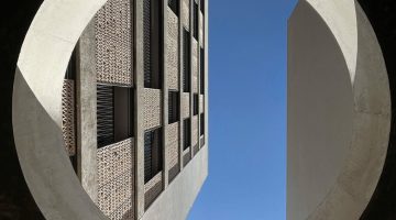
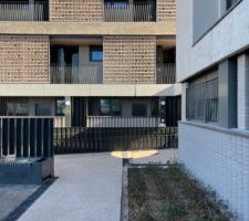
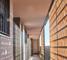
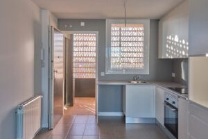
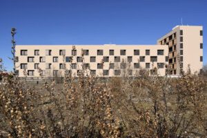
Una vez alcanzados los estándares propios de una sociedad moderna en confort, comodidad y salubridad en las viviendas, tanto por la normativa como por la industria, debemos evolucionar y aportar nuevos niveles de calidad en lo espacial, lo material y en sus posibilidades de evolución.
Es necesario generar propuestas capaces de adecuarse a los nuevos retos sociales y los tipos de núcleos familiares que conforman el tejido social en una exploración de lo cotidiano.
La parcela RC 4 se sitúa en un nuevo desarrollo urbanístico denominado APE 18.05 “La Rosilla” en Madrid junto al distrito de Vallecas. La Rosilla se encuentra en el triángulo formado por la Carretera de Villaverde a Vallecas, la avenida Mayorazgo y la calle Castejón de Henares.
El proyecto busca generar una pieza de transición entre el espacio urbano difuso que lo caracteriza y el nuevo parque situado al sur. Las piezas se organizan en dos escalas alternas, la que agota la altura máxima de ocho plantas y la que cuentan con cinco plantas. Su colocación ortogonal permite una heterogeneidad en la percepción desde la vía pública y una clara discontinuidad en los planos de fachadas. La limitación normativa de profundidad de los edificios a 12 metros y los límites de factores de relación entre zonas comunes y privadas aconsejan organizar el conjunto de accesos a las viviendas mediante núcleos para dos viviendas en el edificio longitudinal y núcleo para 4 en el vertical. En la búsqueda de la mejora de estos aspectos, se organizan viviendas de configuración flexible que permite una estancia pasante que contiene la cocina y el estar claramente separados y un vestíbulo con almacenamiento, de manera paralela a este espacio, se organizan las zonas de noche con los dormitorios. Esta estructura permite incluir 71 viviendas protegidas de precio básico (VPPB), 3 de ellas para PMR.
Los edificios dispondrán de un zócalo denso y rugoso construido mediante fabrica en aparejos con volumen, mientras que el resto de las envolventes de los edificios se construyen mediante un sistema SATE que optimiza el comportamiento energético del mismo. A lo largo del jardín se generan unos núcleos de actividad formados por un espacio de pavimento blando en áreas de juegos infantiles, unos bancos y una zona de plantación de plantas tapizantes y árboles que desarrollen gran porte y hoja caduca, permitiéndose la plantación al liberar el espacio bajo rasante el ámbito central de la parcela.
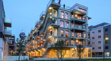
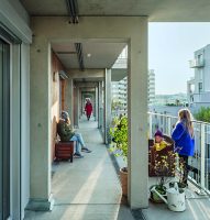
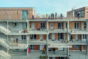
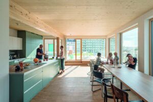
Under the motto “Setting the course together”, the co-housing project Gleis 21 was planned in a participatory manner with the future residents, from urban development to the socket outlet. The property is located in the center of the new urban development area “Leben am Helmut Zilk Park” near the Vienna Central Station („Hauptbahnhof Wien“). The project and the cultural association of the same name want to contribute to the development of the district. Communication within and outward, is key at Gleis 21.
The co-housing project Gleis 21 builds on three major principles: “living in solidarity”, “indulging cleverly”, and “creating with media”. Solidarity is lived in a variety of ways, be it simple neighborhood services or a Solidarityfund for personal emergencies. Lived solidarity also includes certain appartements, that were planned in cooperation with Diakonie Flüchtlingsdienst (a refugee aid organization), that can be given to refugees.
To help shape the cultural, social and media life in the newly developed quarter, a cooperation with Radio Orange, Okto TV and Stadkino Wien (cinema) was formed. The cultural Organization Gleis 21 is going to ensure a steady cultural program adapted to and in unison with its surroundings. A music-school on the lower floor rounds out the cultural scope of opportunity.
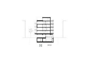
Extensive communal areas represent the focus of the communal aspect and offer space for common and individual use: from the communal kitchen to the library and sauna on the top floor to the workshop, studio and fitness room in the basement. The selection and details of community-spaces were made by the residents and form the center of communal aspects of the project.
The project was designed as a compact, zero-energy house („Niedrigstenergiehaus“) in a wood-hybrid construction and was built in a resources saving way.
The individually planned housing-units on the upper four floors are accessed via an open north-west-facing arcade and are all equipped with private balconies. The neutral and flexible structure of the building enabled each unit to be planned individually in collaboration with its residents
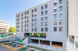
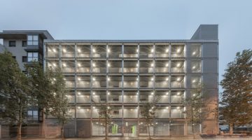
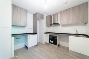
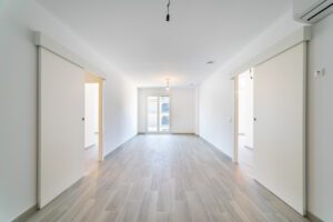
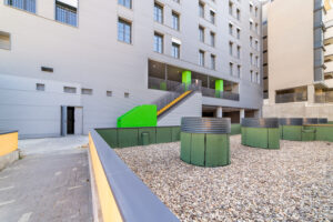
Visitamos un edificio residencial multifamiliar de 25 viviendas de 1, 2 y 3 dormitorios y zonas comunes construidas bajo los estándares de Passivhaus y proyectada conforme al CTE.
La visita que se propone a este edificio promovido íntegramente por la EMVS, es posiblemente una visita al futuro.
Carabanchel 34 es una apuesta absolutamente innovadora, un tipo de construcción de vanguardia que agrupa las viviendas ordenadamente en una pastilla edificatoria con doble orientación.
La vivienda de 1 dormitorio dispone de zona de día formada por cocina, tendedero y estar comedor, y la zona de noche que la integran un baño y un dormitorio. La vivienda de 2 dormitorios dispone de zona de día formada por cocina, tendedero y estar-comedor y la zona de noche que la integran un baño y dos dormitorios. La vivienda de 3 dormitorios dispone de zona de día formada por cocina, tendedero y estar-comedor y la zona de noche que la integran un dormitorio principal con baño incorporado y dos dormitorios y un baño. En nuestra visita al edificio, recorreremos tanto las zonas comunes, como una vivienda de las diferentes tipologías.
Las características del edificio proyectado son:
Alto grado de confort térmico interior, tanto en la estación fría como en la cálida. Rango de confort de 20-25˚C.
Aire de calidad excepcional garantizado durante 24 horas al día.
Calidad en la construcción para evitar o minimizar los puentes térmicos, infiltraciones no deseadas, condensaciones superficiales etc.
Precios asequibles de construcción.
Reducción de las facturas de consumo energético.
Durabilidad en el tiempo de las soluciones constructivas. Garantía de un buen funcionamiento durante muchos años con medidas mínimas de mantenimiento.
No requiere comportamientos específicos del usuario para lograr un correcto funcionamiento.
Niveles elevados de satisfacción por parte del usuario / propietario.
The process has been a collective effort based on negotiation, in collaboration with the local architectural team, Mascha & Seethaler, management experts (Raum&Co), mobility (Traffix), landscaping (Land in Sicht), energy or sociology, as well as representatives of the neighborhood, the soil promoters (ARE) and the MA21 office of the Vienna City Council; all of them active participants in the design process.
The team published the story of this collaborative process as a comic (“Commons”), from the winning project of the Europan 10 competition in Vienna and its later development with a multidisciplinary team until its definitive passing by the Vienna City Council. “Commons” obtained recognition as an example of innovative, sustainable and democratic urbanism.
One of the most challenging issues of today is the question whether housing in itself, as a programme, has the power to generate an urban neighbouthood. “Garden>Courtyard” plays the ball straight back to the municipality, developers and users, suggesting an extrapolated concept of mixing with just a single programme-housing: housing with diverse models of living, diverse models of sharing, diverse models of developing, diverse models of financing, diverse models of landscaping, diverse models of maintaining.
Once the masterplan approved, the landowner (ARE, Austrian Real State) commissioned multiple architecture teams as well as different sporsors to develop an edification design. In the partnership with the Viennese enterprise for social housing and different cooperatives, a collaborative democratic and plural urbanism process was created.
Arenas Basabe Palacios was commissioned with the design and execution of 11 housing blocks in different scales, including 82 housing units with a total of 9500 m2 constructed surface containing community spaces, shared parking facilities for bicycles and commercial spaces in the ground floor for zone.
The design respects the original urban idea and furthermore creates new potential based on the garden-matrix, which is structuring the new district. Each block is constructed around its garden while edification varies in height, bay and edification type: constructions of small scale (size S) contain single-family housing and duplex; Medium-scaled buildings (size M) as their taller complements (size L) serve as collective housing blocks and develop a diverse and porous urban process.
The materiality of the buildings accentuates this idea: Ceramic colour facades are facing the sun, while all living spaces are south-orientated and opened towards the garden. The more intimate bedrooms can be accessed through privacy filters in form of halls which contain service rooms installations and space for storage.
The dwelling´s interiors reflect the characteristic construction system: together with white carpentry, visible vertically perforated bricks (“Hochlochziegel”) are creating a sequence of neutral, flexible and reconfigurable spaces.