Shepherdess Walk Housing

0

Shepherdess Walk Housing

Diseño urbano y arquitectónico

Objetivos principales del proyecto

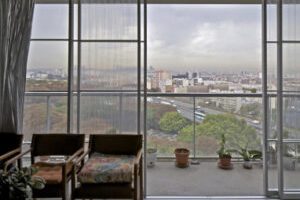
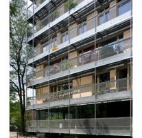
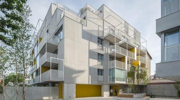
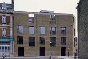
Shepherdess Walk is a contemporary residential development in central London, blending with the historical context of the area. The project features houses and apartments with a split-level design, offering spatial generosity and flexibility. The exterior spaces vary, including walled gardens for houses and panoramic views for apartments. The design draws inspiration from the historical terraced housing of Shepherdess Walk, with subtle variations in façades and a folding effect to create a connection with the surrounding Georgian terrace. The apartment building complements the larger post-war housing nearby. Both buildings are clad in brick, reflecting the local materiality. Deep window reveals and raw interior materials such as plaster, timber, concrete, brass, and steel add character and patina over time. Handcrafted elements like walnut handrails and brass ironmongery provide a tactile quality.

Fecha

  • 2015: Construction

Agentes

  • Architect: Jaccaud Zein Architects

Localización

Continente: Europe
Ciudad: London
País/Región: London, United Kingdom

Breve descripción del proyecto

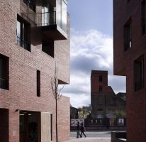
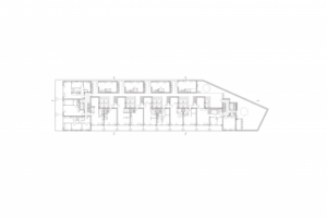
Shepherdess Walk is a new residential development in central London, located near to Old Street roundabout, on the border of Shoreditch, London’s technology hub and design district of Clerkenwell. Situated at the corner of Shepherdess Walk and Wenlock Street, the project establishes positive relations with the different historical conditions and formal qualities of the site to propose an unapologetically contemporary project for a terrace of houses and an apartment building with a strong sense of place.

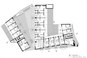
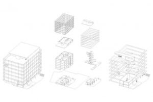
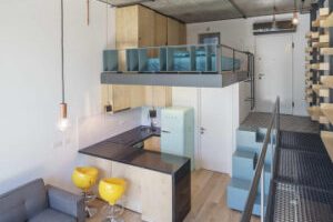
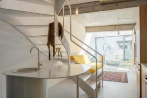
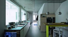
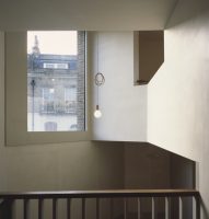
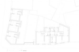
A split-level section was developed in collaboration with Solidspace and has been applied to both houses and apartments. This configuration allows for the juxtaposition of rooms with different usages around double-height connected spaces, offering a sense of spatial generosity and continuity. The complexity of the section is not immediately apparent from the exterior with only hints given by the large-scale windows to the presence of the double height spaces.

The split-level arrangement introduced a strong potential for flexibility for the apartments, allowing for possible subdivisions within each unit with multiple access to the stairwell. This flexibility allows for a possible fragmentation of scale and an evolution of use through time to meet the demands of multiple occupancy, of children growing up, of partial rental of the unit, of working from home or just varying use of the different rooms.

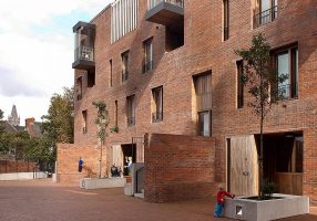
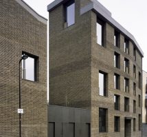
Every dwelling has an exterior space with a variety of specific qualities. If the houses have rear walled gardens which echo the surrounding Georgian types the apartments have a diversity of exterior spaces which open up to spectacular views at the top of the building, incorporating views of London and it’s surroundings into the building. Shepherdess Walk has a rich historical heritage of terraced housing and fragments of the continuous Georgian frontages, still visible despite the heavy bomb damage suffered during the Second World War. The project draws on this historical fabric and reinstates three terraced houses on Shepherdess Walk in a contemporary reinterpretation of the type. Gentle variations of the façades enable a subtle closure of the street towards the adjacent park, giving both orientation to the open space from within the building and clarification of the boundaries of the streetscape. This slight folding echoes the geometry of the adjacent Georgian terrace, reinforcing the historical identity of the street. Facing on to Wenlock Street, the first house folds more sharply asserting its presence towards the south and opening the angle of the site towards a second apartment building. This shift in scale between the two buildings generates a vivid urban juxtaposition that reinforces the presence of the corner in the neighborhood.

The apartment building rises in scale beyond the houses to stitch the development into the context of bigger scale post-war housing which extend beyond

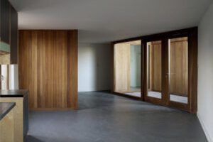
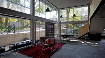
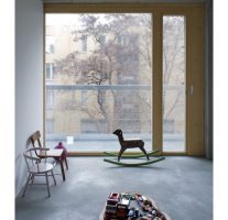
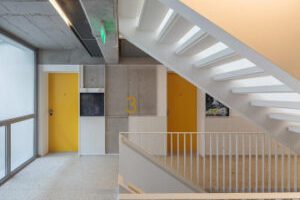
Both buildings are clad in a brick that was chosen to reflect the patinated materiality of the surroundings, once again stitching the development into its context. Slight variations to the pointing of the brickwork allow for a horizontal banding to the apartment building façade, directing the gaze along the depth of the street and marking an articulation in the bulk of the building. Deep window reveals emphasise the threshold between the intimacy of the interior spaces and the street giving a sense of weight and presence to the buildings. All internal spaces have been developed using a palette of raw materials, plaster, timber, concrete brass and steel which are designed to patinate with use, giving each space a specific and unique character which will develop through time. Handrails and ironmongery have been designed to offer a sensual tactile quality, using hand crafted traditional materials such as solid walnut and brass.

Autores:

Collective housing for elderly people and civic and health centre

0

Collective housing for elderly people and civic and health centre

Diseño urbano y arquitectónico Entornos Equidad

Objetivos principales del proyecto

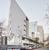
The project comprises 105 senior citizens' housing units and features a double-height plinth with a Health Centre and Senior Community Centre. The design fosters a dynamic community and preserves the existing social network of the neighborhood. Located near Glories' square, the project integrates with the urban fabric of Eixample and responds to Diagonal Street. Three housing volumes on top of the plinth accommodate the program. Each building has seven or eight dwellings per floor, connected by a central corridor. Communal spaces include a rooftop terrace, laundry, porch, and patio-solarium. The layout promotes a sense of limitless interconnectedness, with movable walls and open spaces. The construction system incorporates thermal insulation and a district heating system, resulting in high energy efficiency.

Fecha

  • 2016: Construction

Agentes

  • Architect: peris+toral.arquitectes
  • Architect: Bonell i Gil

Localización

Continente: Europe
Ciudad: Barcelona
País/Región: Barcelona, Spain

Breve descripción del proyecto

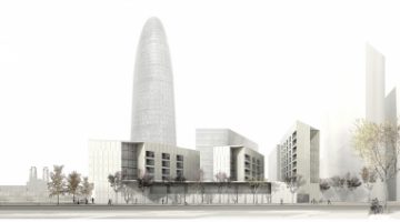
The project organises 105 senior citizens housing into three volumes spread out, on top of a double-height plinth containing a Health Centre and a Senior Community Centre. The building’s common spaces help to create a dynamic community. The mixed-use of the program enable to preserve the existing social network of the neighbourhood. The project is located near Glories’ square. This plot is within the Eixample’s urban fabric. At the same time, is part of a city block trimmed by Diagonal’s Street trace.

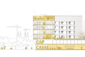
One of the main challenges the project had to face was the mixed-use program with different real estate developments: 105 housing for Barcelona’s council, a Health Centre for regional government, a Senior Community Centre for the district and a vehicle impoundment parking for BSM. We opted for a unitary building in order to organise and to encourage different uses but also to accommodate the whole program: a group of three volumes of housing on top of one double-height plinth containing the facilities.

By overlapping two different urban strategies, the project is capable of giving response to the surroundings’ complexity. On one hand, the continuous base of the building recognises the grid of the Eixample, by leaning on its alignments. On the other, the housing volumes give continuity to the sequence of nearby isolated blocks in respond to Diagonal Street. The void between these blocks is necessary to filter the public space through and to maintain the global unit. The result is an architectural ensemble that despite its domestic height is able to dialogue with the unique geometry of the high and sharped nearby buildings, joining into a greater scale urban piece of strong identity.

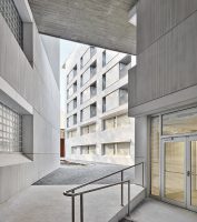
Depending on the block, each building has seven or eight dwellings by floor with a central corridor. This walkway enlarges at both ends where it receives daylight.

At the top floor of each building there are a communal laundry, a covered porch with clothes lines and a patio-solarium with foreseen urban-garden.

At the plinth’s roof level, each building has a multi-use room connected directly with the outside terrace enabling the social services managing the building to organise workshops or activities.

This communal terrace, located at the treetops’ height and endowed with benches, is opened to the surrounding views. It integrates the three blocks into a larger community of neighbours.

Considering these are dwellings for elderly, users are meant to spend long periods of time at home and at the building. Thus, communal spaces enhance and enrich the experience of living. This dwelling’s typology is organised around a central core of serving spaces, which is surrounded by the bedroom and the living room, both understood as a continuous and flexible space articulated by the terrace. This layout enables to perceive space as limitless, not enclosed but interconnected. The bathroom segregates into two pieces: a more private area and an open space.

Spaces connect or segregate through large sliding doors, like movable walls. If they are all open, space flows around the core. Depending on whether doors either open or close, space is transformed so it can be differently used.

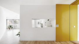
The corner’s typology repeats the same scheme of serving spaces. The entrance threshold is enlarged to host the dinning room, linked by a window to the kitchen. The sights connect with the exterior through a large series of frames. The enfilade of doors and windows increase the porosity of space; and as a result, space seems larger than it is.

Rooms are never enclosed, they always vanish into neighbouring spaces slightly introduced for the occupant to imagine. Tangent views flow around the core, linking contiguous spaces.

The dwellings’s structure consists on perimeter walls and pillars always located on the in-between apartments walls so that a free plant is guaranteed. It is at the ground floor level and by using cross-beams where the structure turns into an orthogonal grid of pillars of 7,5×7,5m for the parking located at the lower floors.

The construction system of the housing façade is different than the one for the plinth. The one of the dwellings consists in External Thermal Insulation Composite System (ETICS) improving the thermal inertia of the building, whereas in the lower floors Glass Reinforced Concrete (GRC) is used. Both systems guarantee a thermal break, providing maximum comfort.

The building is connected to a district heating system, providing sanitary hot water and central heating. Inside the houses, we opted for a low-temperature underfloor-heating system in order to obtain greater comfort with less consumption. Due to all these resources, the building is qualified with an A for European energy labeling.

Autores:

Verdana Blok K

0

Verdana Blok K

Diseño urbano y arquitectónico Entornos Calidad Habitabilidad

Objetivos principales del proyecto

Blok K, part of the Het Funen master plan by Architecten Cie, consists of ten houses organized in a "back-to-back" typology. The apartments have their entries through a central aisle, eliminating the need for storage spaces on the facades. By slightly rotating the aisle and directing it towards open spaces between the blocks, a public shortcut and diagonal vista are created. Each house is unique, with apartments spanning two to four stories and ranging from 140 to 180 m², but they form a cohesive whole.

Fecha

  • 2009: Construction

Agentes

  • Architect: NL Architects

Localización

Continente: Europe
Ciudad: Amsterdam
País/Región: Amsterdam, Netherlands

Breve descripción del proyecto

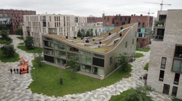
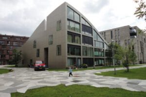
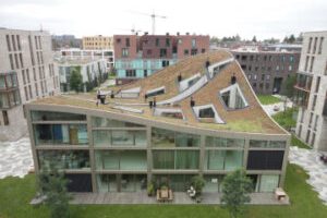
Blok K or Verdana, is part of a master plan by the Architecten Cie, called Het Funen, Hidden Delights , which calls for a total of 500 dwellings and a park. The block contains ten houses and the point of departure for the project was that the urban envelop should be distributed evenly over all of them.
Having been organised according to the “back-to-back” typology, the entries to the apartments are via an aisle in the middle of the block, which rids the facades of the obligatory storage spaces and technical installations that must be publically accessible. By slightly rotating the aisle and orienting it onto two open spaces between the blocks instead of onto two “blind” walls, a public shortcut has been provided and within the orthogonal grid a diagonal vista opens up. Although each of the houses are unique, with apartments ranging from two to four stories, and from 140 to 180 m², together they are one.

Autores:

Timberyard Social Housing

0

Timberyard Social Housing

Diseño urbano y arquitectónico Entornos Calidad Habitabilidad

Objetivos principales del proyecto

This Dublin project arose from the need to relocate residents affected by road construction. The 47-unit development was designed in consultation with local residents and meets high environmental standards. The concrete structure allows for flexible apartment layouts. The triangular courtyard offers a secure social space with window seats, balconies, and winter gardens. The use of brick and timber reflects the surrounding area's architecture and history as a timberyard.

Fecha

  • 2009: Construction

Agentes

  • Architect: O’Donnell + Tuomey

Localización

Continente: Europe
Ciudad: Dublin
País/Región: Dublin, Ireland

Breve descripción del proyecto

This project in the historic Liberties area of Dublin arose from the need to relocate the residents of the existing pockets of social housing that had been demolished in order to make way for a new road. The client brief, which was set out in consultation with the local and new residents, called for an exemplar social housing development and in response, this 47-unit project provides compact city living adjacent to schools and services. Built to the latest environmental standards including fuel and energy conservation, the concrete structure enabled a greater flexibility with apartment layouts by stepping the internal party walls vertically. 2106 14137 2106 14135

The triangular courtyard provides a secure social space with passive surveillance from the adjacent apartments. This space is animated by window seats at ground level with recessed balconies and projecting winter gardens above. Brick and timber echo the existing housing and industrial buildings, and the former use of the site as a timberyard.

Autores:

Transformation of Tour Bois-le-Prêtre Housing Block

0

Transformation of Tour Bois-le-Prêtre Housing Block

Diseño urbano y arquitectónico Servicios e Infraestructura Calidad Inclusión

Objetivos principales del proyecto

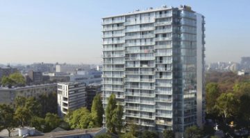
This 16-storey high-rise block in Paris was transformed instead of being demolished. New flooring was added to each level, creating closable terraces for winter gardens and balconies. The apartments were improved with more natural light and energy efficiency. The small windows were replaced with large openings for panoramic views. The entrance hall was refurbished, removing unnecessary rooms and making it open and transparent. Collective activity areas and lifts were added, and prefabricated construction allowed residents to stay during renovations.

Fecha

  • 2011: Rehabilitación

Agentes

  • Architect: Lacaton & Vassal architectes
  • Architect: Frédéric Druot Architecture; 

Localización

Continente: Europe
Ciudad: Paris
País/Región: France, Paris

Breve descripción del proyecto

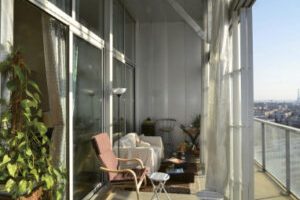
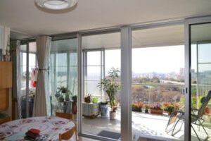
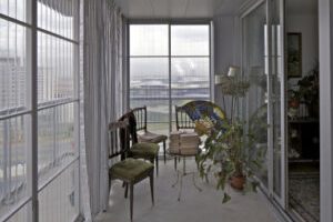
Built in the early 60s along the ring road on the northern periphery of Paris, this high-rise block of 16 storeys contains 96 apartments. Instead of demolition, which was the first option that was considered, a project of transformation of the existing building was decided upon.The project proposed a generous expansion of the apartments. On each level, new flooring, which was built as a self-supporting structure, was added onto the entire periphery of the tower. This design strategy allowed for the extension of all the rooms by creating closable terraces that could act as winter gardens as well as balconies for each unit.

At the same time the overall quality and comfort of the apartments was improved with additional natural light and the reduction of energy consumption for heating. The existing facades with their small windows were removed and they were replaced by large transparent openings so that the residents can enjoy the exceptional panoramic views over Paris. The entrance hall on the ground floor was refurbished and it was made level with the exterior. All the useless rooms and installations were removed in order to make the entryway an open and transparent space through which the new garden can be accessed. On the sides of this space, areas for collective activities were established and two lifts were installed to improve the vertical circulation to the apartments. The construction was carried out with prefabricated elements so that the inhabitants could remain in the apartments during the renovation of the building.

Autores:

R50 Cohousing

0

R50 Cohousing

Diseño urbano y arquitectónico Inclusión Iniciativa público-privada Procesos participativos

Objetivos principales del proyecto

R50 - cohousing in Berlin-Kreuzberg is a joint building venture project with 19 apartments and shared spaces. The concrete structure and modular timber facade were specifically designed for this building, allowing a direct dialogue between architecture and use. The compact and efficient design process involved extensive participation and led to agreements on shared spaces, including an urban garden, access ramp, laundry, workshop, and roof terrace. The building offers low-cost and adaptable housing with a sustainable approach to urban living, integrating into the existing fabric.

Fecha

  • 2013: Construction

Agentes

  • Architect: ifau
  • Architect: Jesko Fezer
  • Architect:  HEIDE & VON BECKERATH

Localización

Continente: Europe
Ciudad: Berlin
País/Región: Berlin, Germany

Breve descripción del proyecto

R50 - cohousing is a joint building venture project in Berlin-Kreuzberg. It was initiated by the architects during the course of a concept-based award procedure for building plots and implemented in close cooperation with the clients. The building proposal is founded on a clear urban design position, robust and precisely detailed architectural design, and both a collective and individual process of occupancy.

The detached building is surrounded by various housing concepts characteristic of Berlin’s post-war period. It has six full storeys, a basement and an attic. It comprises three blocks with 19 individual apartments, one studio and various shared spaces. Underneath is a double-height, flexible community space which connects the building’s main access with the public street space. It is made available for neighbourhood groups and other public uses. The reinforced concrete structure was designed to minimum requirements. Combined with the reduced and partly exposed infrastructure, the modular timber facade with fixed and flexible, outward opening glazed door elements was specifically developed for this building. This combined with the all-around balconies on each level allows a direct dialogue between the building’s architecture and its use.

Meeting the owners’ aspiration for collective and affordable living and working, the architectural concept is based on a compact and efficient structure with carefully detailed connections on different scales. It is based on a concrete skeleton with one access and two service cores, an independent timber facade and a suspended steel construction for the all-around balconies. A slightly sunken basement level provides access to the building and merges private and public spaces. Each apartment and all additional community spaces were developed by an intensive process of consultations, discussions and design. Based on the structural framework the sizes of apartments could be determined and individual requirements accommodated in the floor plans. In parallel to this process, a common standard for fixtures and fittings was developed and defined, which has resulted in a collective approach to interior fittings, the use of materials and some surfaces left unfinished, whilst allowing individual layouts of the apartments.
This kind of structured yet open design process has not only allowed for extensive participation, self-directed design and self-building, but has also led to mutual agreement on the type, location, size and design of spaces shared by residents. This includes the generous urban garden, which naturally blends into the landscape of the surrounding 1960s residential neighbourhood, an access ramp leading to a covered area in front of the basement, a laundry, a workshop and a roof terrace with a summer kitchen and a winter garden. The all around balconies accompany the bright interior spaces and connect the apartments on each floor.

Plot 2,056 m2
GFA 2,780 m2
Net usable space 2,311 m2
Living space 2,158 m2
Community space 122 m2
All-around balconies 462 m2
Roof terrace 38 m2

R50 cohousing is a new model typology for low-cost and affordable housing offering a maximum capacity for adaptation and flexibility throughout its lifetime. Social, cultural, economic and ecological aspects have been considered equally to define a contemporary sustainable approach to urban living. The limit set by German Energy Saving Regulations (EnEV 2009) was reduced by 30%. Another essential aspect of sustainability is the building’s particular ability to integrate into the existing urban fabric.

Urban Spaces 1 / Dogarilor Apartment Building

0

Urban Spaces 1 / Dogarilor Apartment Building

Diseño urbano y arquitectónico Servicios e Infraestructura Habitabilidad

Objetivos principales del proyecto

Located in Mulhouse's popular district near the city center, this project consists of 59 social rental dwellings developed by SOMCO. Our goal is to provide generous dwellings without increasing rent. We aim to address the issue of densification in Bucharest's central area while preserving the qualities of the existing neighborhood. The building design seeks to maintain the narrow plots' porosity and blend with the surrounding collage-like appearance. It balances the required alignment with the specific characteristics of the street and urban fabric. The apartments offer diverse typologies, ranging from studios to four-bedroom units, with private courtyards, balconies, or terraces. Common spaces, commercial areas, and ateliers are also included. The flexible design allows for unit combinations, resulting in a total of 77 residential units and approximately 50 apartment types. Site size: 2082 m2; Building size: 8931 m2.

Fecha

  • 2014: Construction

Agentes

  • Architect: ADN Birou de Arhitectura

Localización

Continente: Europe
Ciudad: Bucharest
País/Región: Bucharest, Romania

Breve descripción del proyecto

The project is located in Mulhouse in a popular district close to the city center, currently under renovation. It includes 59 social rental dwellings developed by SOMCO, operator on public social housing. A few years after the Cité Manifeste experience, our common goal was to pursue the same aims: generous dwellings without increasing the rent. One of the most important and problematic aspects of nowadays Bucharest is the fast densification of the central area. While we believe that density can, and many times must be seen as a form of sustainability, we also admit that the often fragile relationship between habitation within an old neighborhood and the increase of density could many times alter the place and reduce its existing qualities.

Our project is looking for an appropriate answer to this problem. It tries to mediate between different sizes and densities, in a quite central neighborhood characterized by small streets, long, narrow plots and a puzzle of old and new buildings of all types and scales. The building searches to preserve, at its own scale, the porosity and “profoundness” of the deep, narrow plots, while also trying to capture part of the “collage”-like appearance of the surroundings. The volumetric proposal seeks to partially open the building to the street, in the depth of the plot. Because of this, the volume facing the street is less compact and the ground floor is more transparent, in order to allow a better visual connection at eye s level. In this way, we have also tried to mediate between the continuous alignment required by the urban regulation and the specific of the street and of the surrounding urban fabric, characterized by fragmentation. At the same time, the project proposes a type of habitation which we consider suitable for the center of the contemporary city: a place where the relatively small spaces and the density are complemented by diversity and wider common spaces. Most of the apartments are different from one another, not only in size, but especially in typology: they range from studios to four-bedroom apartments – each one of them laying on one, two or even three floors and having private courtyards, balconies or terraces of different sizes. They all are complemented by several indoor and outdoor common spaces (terraces, party room, large halls etc.), while the ground floor offers several commercial spaces and ateliers to rent, towards the street and the inner courtyard. The apartments are conceived in such way as to allow a great deal of flexibility, making it possible to connect (horizontally or vertically) two or more small units into a larger one, leading, in the end, at a building consisting of 77 residential units offering approx. 50 types of apartments. Size of the site: 2082 m2; Size of the building: 8931 m2

Autores:

DeFlat Kleiburg

1

DeFlat Kleiburg

Diseño urbano y arquitectónico Entornos Habitabilidad Equidad

Objetivos principales del proyecto

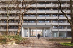
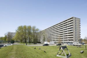
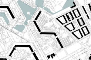
De Flat is a groundbreaking renovation of Kleiburg, one of the largest apartment buildings in the Netherlands. It consists of 500 apartments, spanning 400 meters in length and 10 + 1 stories high. Consortium De FLAT saved the building from demolition by transforming it into a Klusflat, where residents renovate their own apartments. Kleiburg is located in the Bijlmermeer, an Amsterdam residential expansion influenced by CIAM.

The renovation focused on preserving the main structure while leaving the apartments unfinished, creating a new housing business model in the Netherlands. Instead of individualizing and differentiating the building, the goal was to embrace unity and revitalize the entire structure. Concrete additions were removed, restoring the original horizontal balusters and opening up the facade. Sandblasting revealed the beauty of the pre-cast concrete balusters.

The storage spaces were relocated to each floor, freeing up the ground level for social activities and integrating the building with the surrounding park. Double-height connections were created to enhance scenic relationships. Energy-saving motion detectors were used for gallery illumination, allowing the individual apartments to shine.

Overall, De Flat showcases the intrinsic beauty of the building, emphasizing unity, and creating a unique housing concept.

Fecha

  • 2016: Rehabilitación

Agentes

  • Architect: XVW architectuur
  • Architect: NL Architects

Localización

Continente: Europe
Ciudad: Amsterdam
País/Región: Amsterdam, Netherlands

Breve descripción del proyecto

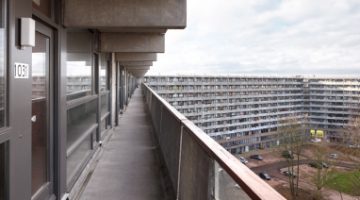
De Flat is an innovative renovation of one of the biggest apartment buildings in the NL called Kleiburg, a bend slab with 500 apartments, 400 meter long, 10 + 1 stories high. Consortium De FLAT rescued the building from the wracking ball by turning it into a Klusflat meaning that the inhabitants renovate their apartments by themselves. Kleiburg is located in the Bijlmermeer, a CIAM inspired residential expansion of Amsterdam.

A renewal operation started mid nineties. Many of the characteristic honeycomb slabs were replaced by suburban substance, by ‘normality’.

Kleiburg was the last building in the area still in its original state; in a way it is the “last man standing in the war on modernism”.

The idea is to renovate the main structure -elevators, galleries, installations- but to leave the apartments unfinished and unfurnished: no kitchen, no shower, no heating, no rooms. This minimizes the initial investments and as such creates a new business model for housing in the Netherlands.

Most attempts to renovate residential slabs in the Bijlmer had focused on differentiation. The objective: to get rid of the uniformity, to ‘humanize’ the architecture. By many, repetition was perceived as evil.

But after three decades of individualization, fragmentation, atomization it seems an attractive idea to actually strengthen unity: Revamp the Whole!

It is time to embrace what is already there, to reveal and emphasize the intrinsic beauty, to Sublimize! In the eighties three shafts had been added including extra elevators: they looked ‘original’ but they introduced disruptive verticality. It turned out that these concrete additions could be removed: the elevators could actually be placed inside the cores, the brutal beauty of the horizontal balusters could be restored.

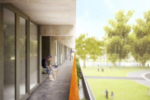
On the galleries the division between inside and outside was rather defensive: closed, not very welcoming. The closed parts of the facade were replaced with double glass. By opening-up the facade the ‘interface’ becomes a personal carrier of the identity of the inhabitants, even with curtains closed…
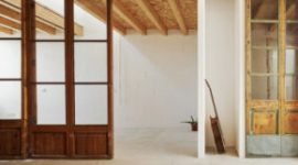
Sandblasting the painted balusters revealed the sensational softness of the pre-cast concrete: better than travertine!

Originally the storage spaces for all the units were located on ground level. The impenetrable storerooms created a ‘dead zone’ at the foot of the building. By positioning the storage on each floor we could free up the ground floor for inhabitation, activating it to create a social base and embedding the ‘beast’ in the park.

More generous, double height connections between both sides of the building were formed creating scenic relationships.

Gallery illumination has a tendency to be very dominant in the perception of apartment buildings with single loaded access. The intensity of the lamps that light up the front doors on the open-air corridors overrules the glow of the individual units. The warm ‘bernstein’ radiance of the apartments is ‘obscured’ by a screen of cold lights. But what if the gallery lights worked with energy saving motion detectors? The individual units now define the appearance. Every passer-by a shooting star!
Autores:

LIFE REUSING POSIDONIA/ 14 social dwellings in Sant Ferran, Formentera

0

LIFE REUSING POSIDONIA/ 14 social dwellings in Sant Ferran, Formentera

Desajustes Cambio Climático
Diseño urbano y arquitectónico Calidad

Objetivos principales del proyecto

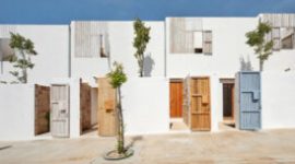
Life Reusing Posidonia is a Climate Change Adaptation Project funded by the European LIFE + program. It integrates Heritage, Architecture, and Climate Change to explore sustainable solutions using local resources. The project focuses on reusing Posidonia, a type of seaweed, as a key material throughout the building.

Fecha

  • 2017: Construction

Agentes

  • Architect: Joaquín Torrebella Nadal
  • Architect:  Alberto Rubido Piñón
  • Promotor: Institut Balear de l’Habitatge (IBAVI)

Localización

Continente: Europe
Ciudad: Formentera
País/Región:

Breve descripción del proyecto

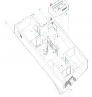
Life Reusing Posidonia is a Climate Change Adaptation Project financed by the European LIFE + program for nature conservation projects. The project links Heritage, Architecture and Climate Change with the aim to recover the local resources as a cultural approach in the contemporary research for sustainable solutions.

Traditional architecture has been a constant reference, not for its forms, but as a way of working. By doing so, we look for the available local resources: the juniper trees are now fortunately protected and the sandstone quarries (marès) have been depleted. Therefore, we only have what arrives by sea: Posidonia. So we propose a shift in approach which has been applied to every single part of the building:

“Instead of investing in a chemical plant located 1,500 km away, we could invest the same amount in local labor, who should lay out the Posidonia to dry under the sun and compact it by hand. Sea salt acts as natural biocide and is completely environmentally friendly.” The use of dry Posidonia as thermal insulation reminds us that we do not live in a house but an ecosystem.
1. TO DEMONSTRATE:

The viability of constructing the prototype with an additional cost of 5% over the usual price of the IBAVI social housing buildings.

2. TO REDUCE:

63% of CO2 emissions during the construction of the building.
775,354.6 kg/CO2 have been saved. Calculation performed through the TCQ program of ITEC.
75% of useful energy during the lifetime of the building.
Nearly Zero Energy Building (nZEB), with maximum consumption of 15 kWh/m²/year (17,226.30 kWh/year).
The average thermal comfort measured in situ is 21ºC in winter and 26ºC in summer.
60% water consumption.
Maximum limit 88 l/person and day. Average consumption based on the tenants’ bills.
50% waste production during the construction phase
36.98 tones have been saved due to in-site reusing measures.

3. ORGANIZATION & PROGRAM

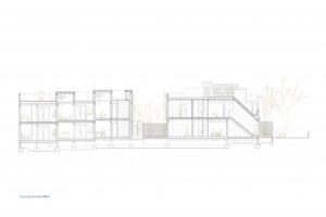
The two street facades facing main sea breezes (North & East) to cool in summer allow dividing the volume into two separate blocks with different orientations.
The entrance to all homes is directly on to the street.
All the dwellings face two directions and cross ventilation thanks to the layout of the living room in a Z shape and a bedroom at each corner.

All the materials have been selected through a market study based on their embodied energy and the transport cost to Formentera.

We tested solutions based on the recovery of eco-friendly local artisan industries with KM 0 raw materials, which are in danger of extinction. Usually these are small family companies that do not have eco-labels, but they can easily be inspected in person. The combined use of these available local materials with those imported that do have environmental labels is a replicable model that makes it possible to reduce more than 60% of CO2 emissions during the works. For instance, load-bearing walls with non-reinforced lime foundations, laminated wood slabs, white lime plaster on facades, sandstone cistern vaults, handmade glazed tiles, bricks baked in biomass mortar kilns, etc.

All indoor carpentry and the shutters on the ground floor were made of reused second hand doors and wood from the ‘Deixalles’ waste-management plant in Mallorca.

The organization of spaces and formal decisions have been the result of knowing the advantages and limitations of natural materials, which are more fragile. This fragility has become a design opportunity.

Autores:

Residential and studio building at the former Berlin flower market

0

Residential and studio building at the former Berlin flower market

Diseño urbano y arquitectónico Entornos
Promoción y producción Innovación

Objetivos principales del proyecto

This project aimed to create a building group at the former Berlin flower market, offering owner-occupied artists' workshops, apartments, cooperative housing, and studios. The architects ifau and HEIDE & VON BECKERATH collaborated with Selbstbaugenossenschaft Berlin eG to provide live and work units for artists and creative professionals. The site's central location and low land price allowed for cross-subsidization, enabling low rents for cooperative spaces. The building's layout and design were developed collaboratively with the building group, incorporating communal facilities. The architectural concept included horizontal access cores, atriums, and flexible floor plans to meet occupants' needs. The building utilized cost-efficient prefabricated components and environmentally sustainable materials. The design also allowed for future conversion, retrofitting, and adaptation. The project included 66 apartments, 17 studios, and three commercial units designed to accommodate individual preferences.

Fecha

  • 2018: Construction

Agentes

  • Architect: ifau
  • Architect:  HEIDE & VON BECKERATH

Localización

Continente: Europe
Ciudad: Berlin
País/Región: Berlin, Germany

Breve descripción del proyecto

Owner-occupied artists’ workshops and apartments, cooperative housing and studios, space provision for social associations and commerce were part of the programme, which would establish a new building group and hence lay the foundation for the residential and studio building at the former Berlin flower market. The main idea for the project, which was initiated by the architects ifau and HEIDE & VON BECKERATH in cooperation with the Selbstbaugenossenschaft Berlin eG, was to offer a mix of live and work units that would meet the needs of artists and creative professionals. The starting point for the building’s layout and design was a collaborative and socially mixed utilisation concept. Moreover, the comparatively low land price allowed the cross-subsidisation of cooperative residential and studio spaces within the project, which can be let at a sustainable low rent. The decision-making process determining the development of a binding standard for fittings and the type and position of several communal facilities took place in close collaboration with the building group.

The site’s central location near Friedrichstraße suggests that the present mix of uses, which includes inexpensive housing in the neighbourhood, is at risk in the foreseeable future. To redress this trend a concept-linked award procedure was launched for the flower market site and an innovative multi-stage qualification process was developed, whose aim was to support the ongoing project and assure the quality of architecture and urban development. The architectural concept is based on three connected horizontal access cores as well as the relation between the building envelope and five internal atriums. These parameters describe and inform the type of units and integrate the building into the neighbourhood. The access at ground level accommodates access to various studios, a garden, communal utility rooms and a basement. The access on level 1 is linked to green atriums and provides access to apartments on two levels. Another access route is situated on level 4 as well as a shared space and a roof terrace. All apartments and studios can be combined and some of them even linked directly in the design development stage to adapt the spatial concept to the occupiers’ needs. The structure is a combined cross-wall and column construction. The underlying principle is that units in the centre of the building are arranged in modules over a depth of 23 m while units at the ends of the building relate to their surroundings. All ground floor spaces are transparent and can be extended into the adjacent public areas. The building envelope combines ceramic elements, windows and fixed glazing in its facade. Generous prefabricated balconies are situated in the south and west. The building is designed with cost-efficient prefabricated components and could be mostly constructed to the energy efficiency standard 70 of the German Energy Saving Ordinance using mainly environmentally sustainable building materials. Access concepts and floor plans are flexible to accommodate possible conversion and retrofitting as well as adaptation to changing demands. The design of the floor plans for the 66 apartments is both demand-based and user-oriented. Seventeen studios and three commercial units are designed as blanks so that the different needs of individual occupants can be incorporated in the standard of fittings.

Autores: