Silodalm, Amsterdam
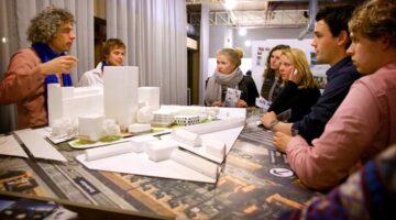
Main objectives of the project
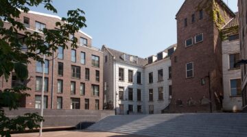
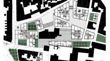
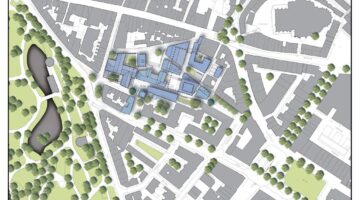
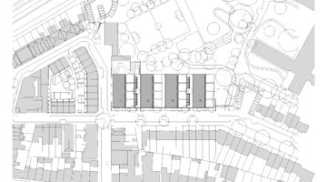
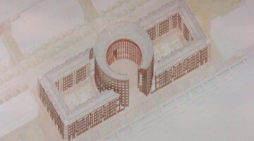
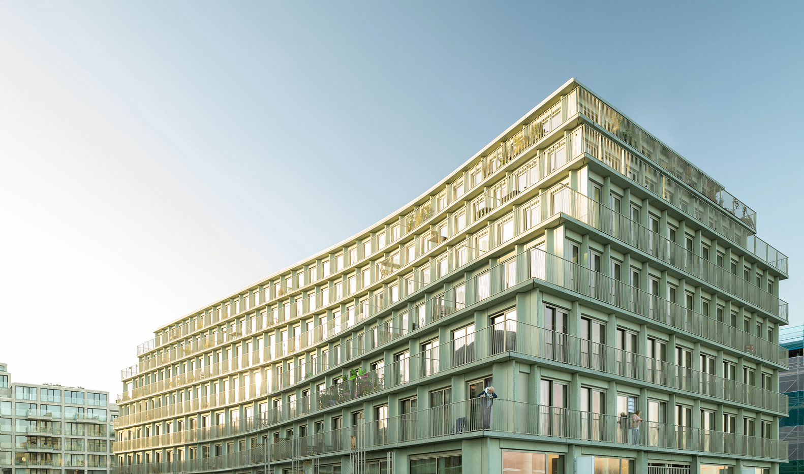
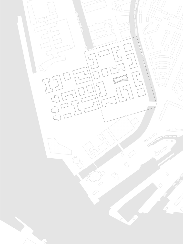
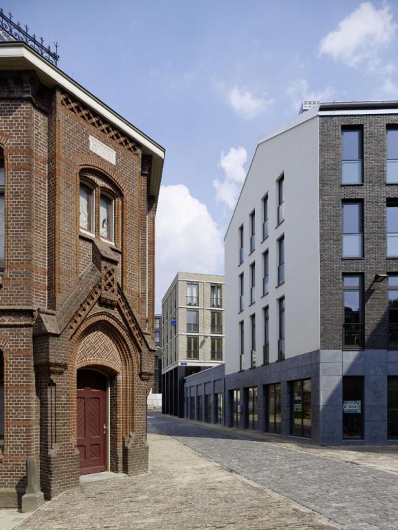
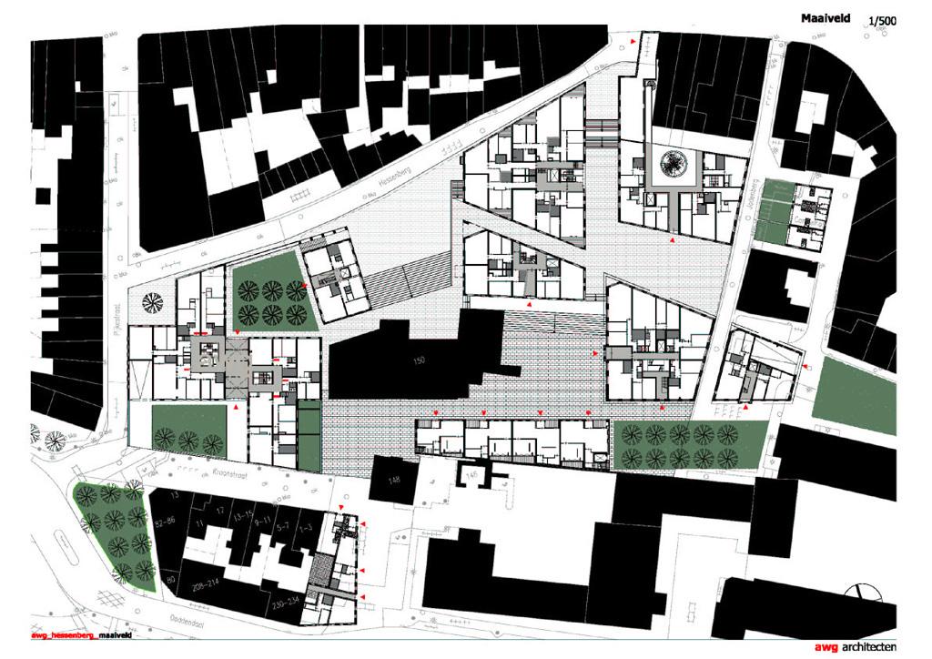
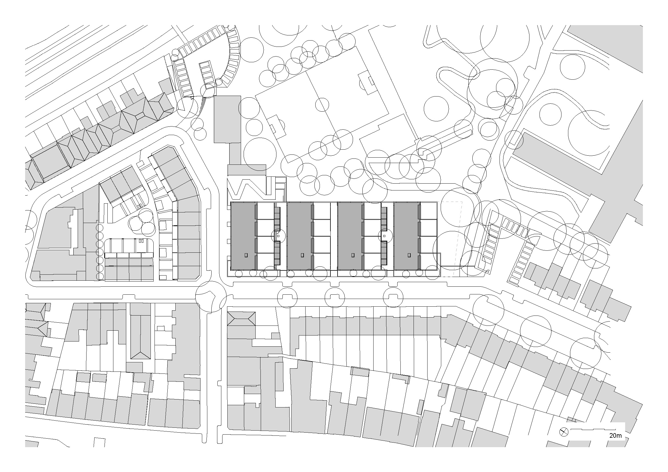
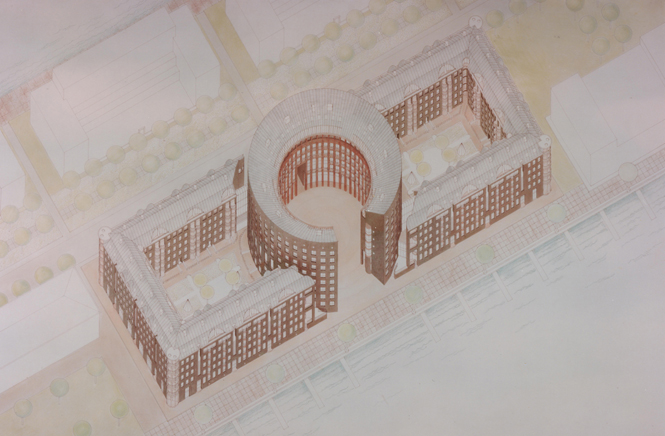
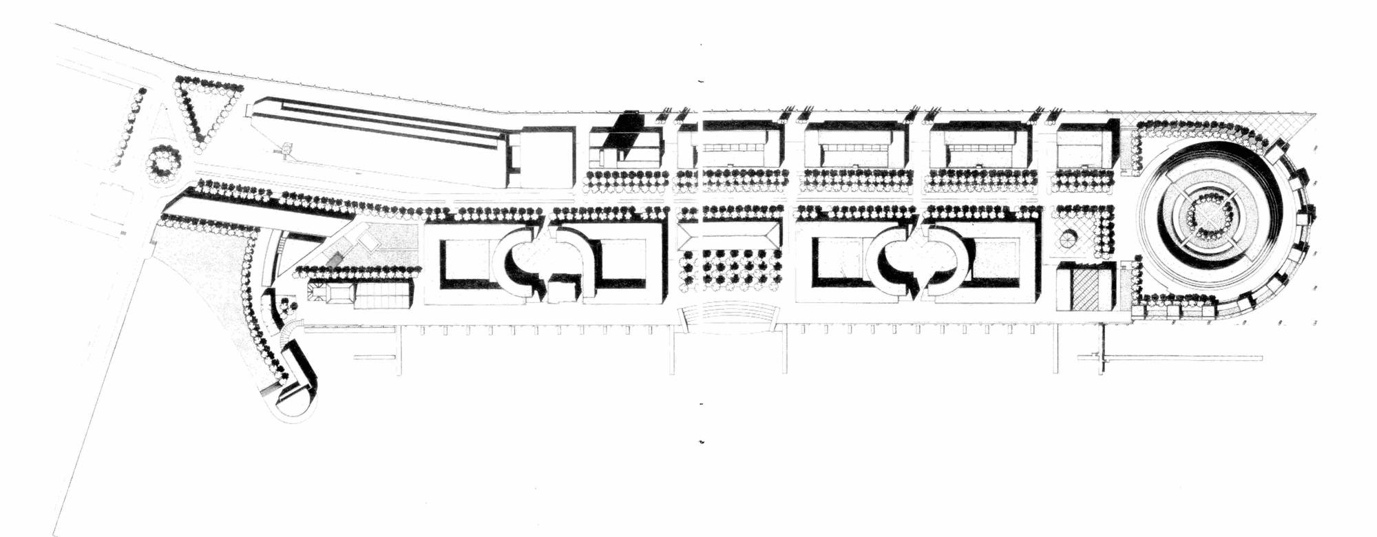
In the western part of the Amsterdam harbour, an extensive urban redevelopment references a former dam and silo building. This project features a mixed-use program that includes housing, offices, workspaces, commercial areas, and public spaces, all arranged within a 20-meter-deep, ten-story-high urban structure. The apartments vary significantly in size, price, and layout, catering to a diverse demographic and the desire for individuality.
Date
- 2003: Construction
Stakeholders
- Architect: MVRDV
Location
City: Amsterdam
Country/Region: Amsterdam, Netherlands
Description
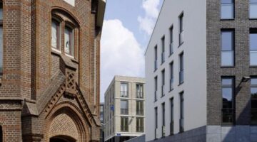
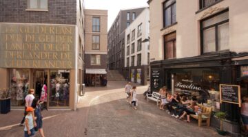
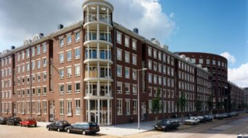
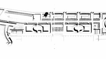
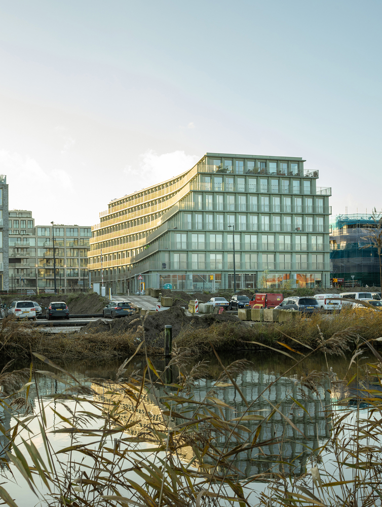
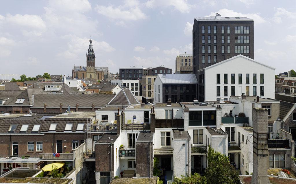
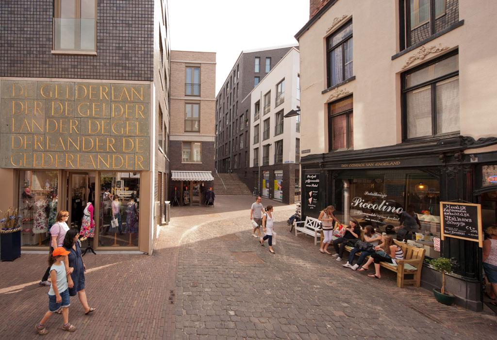
In the port of Amsterdam, an extensive urban development operation was launched to densify the city and meet market demands, even in one of the most vulnerable areas. A former dock with a silo building has been transformed into a new neighbourhood that includes costly components: a dock with underground parking, renovation of the silo buildings, more affordable housing, an underwater tanker protection barrier, deep pile foundations and temporary dry dock constructions.
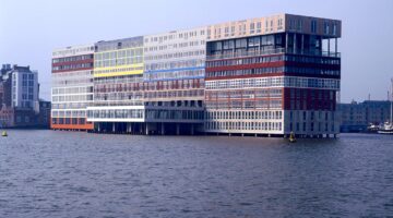
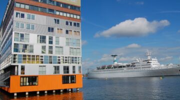
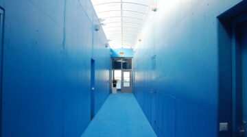
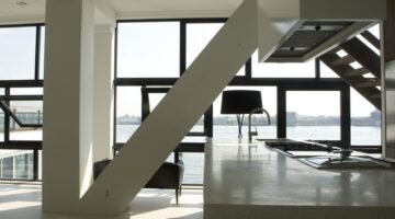
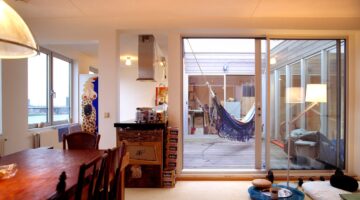
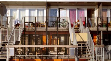
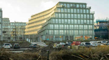
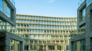
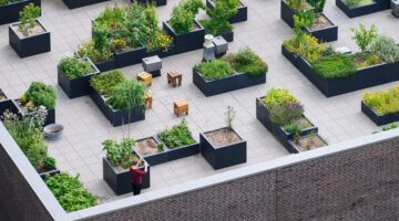
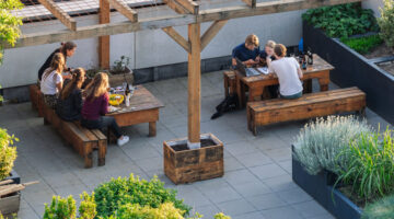
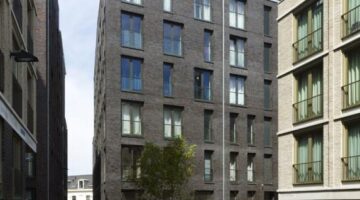
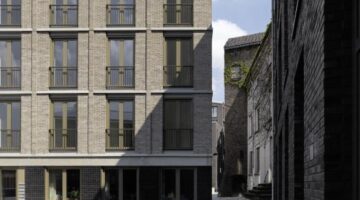
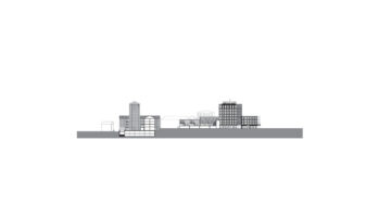
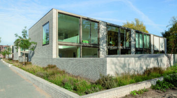
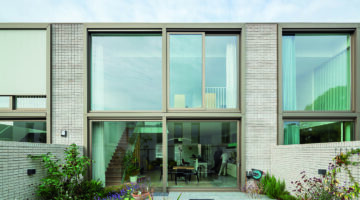
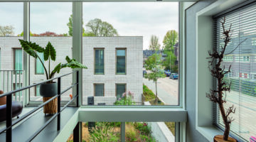
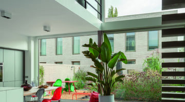
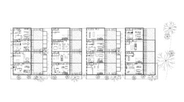
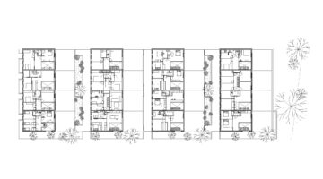
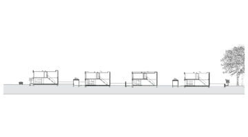
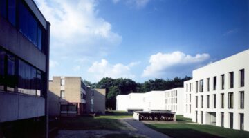
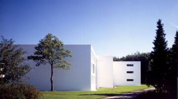
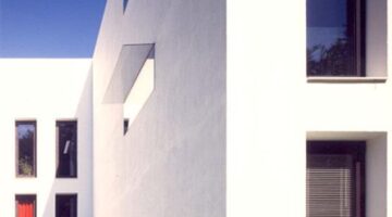
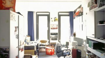
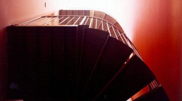
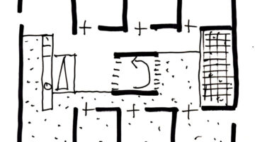
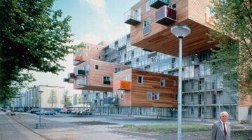
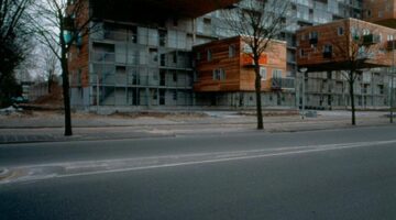
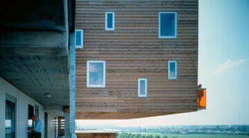
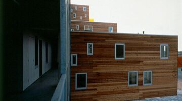
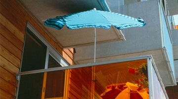
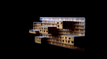
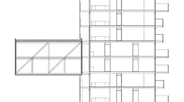
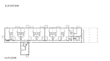
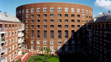
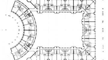
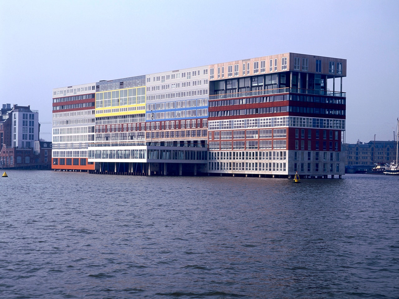
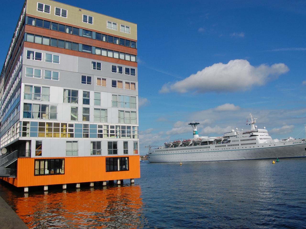
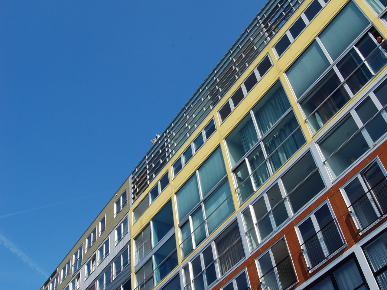
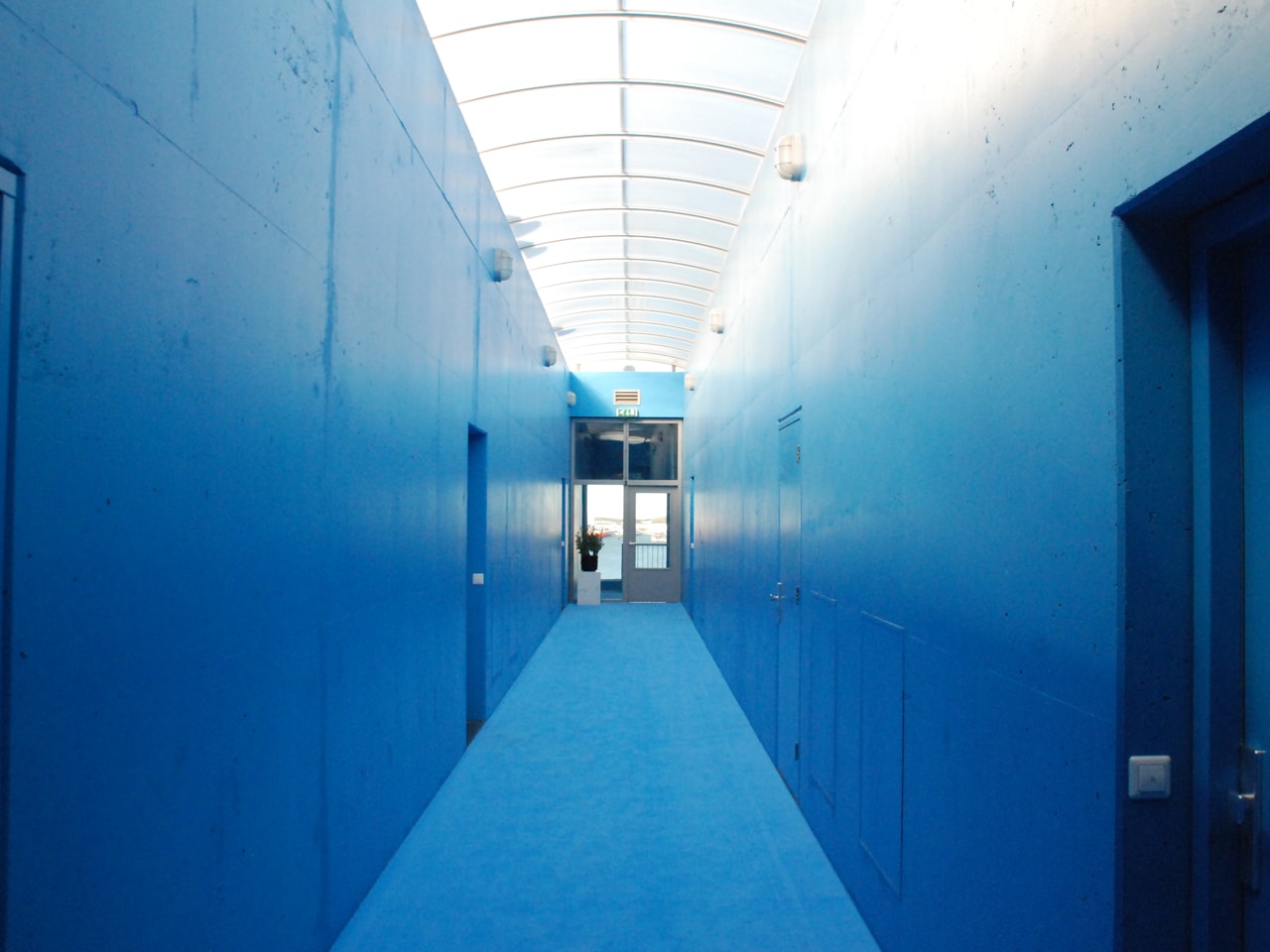
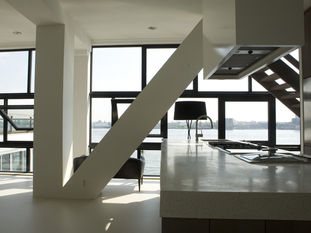
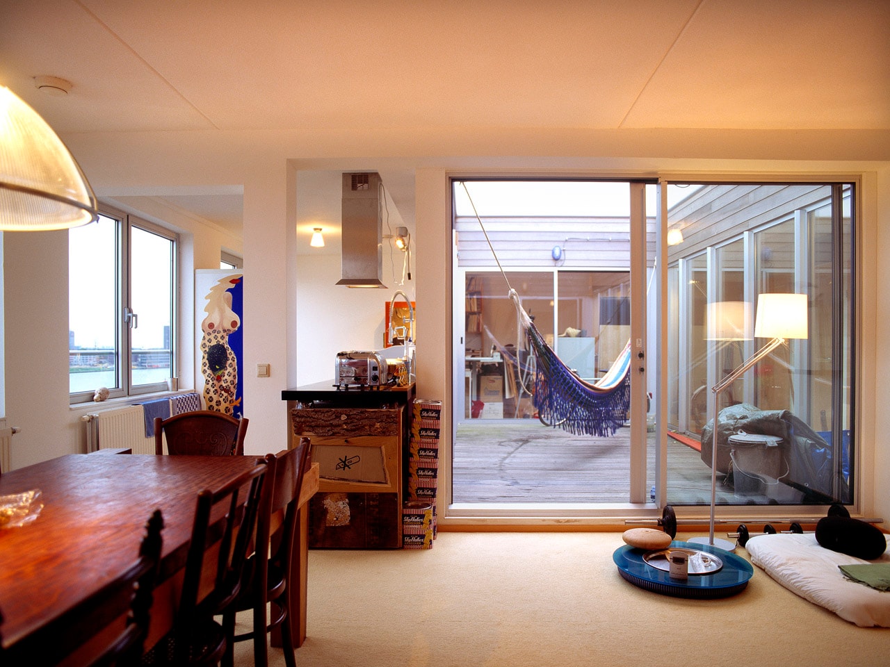
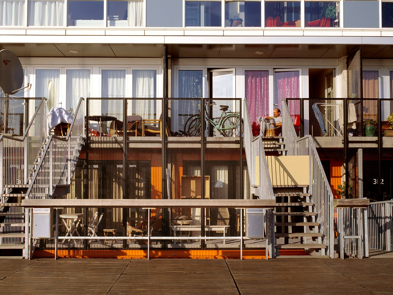
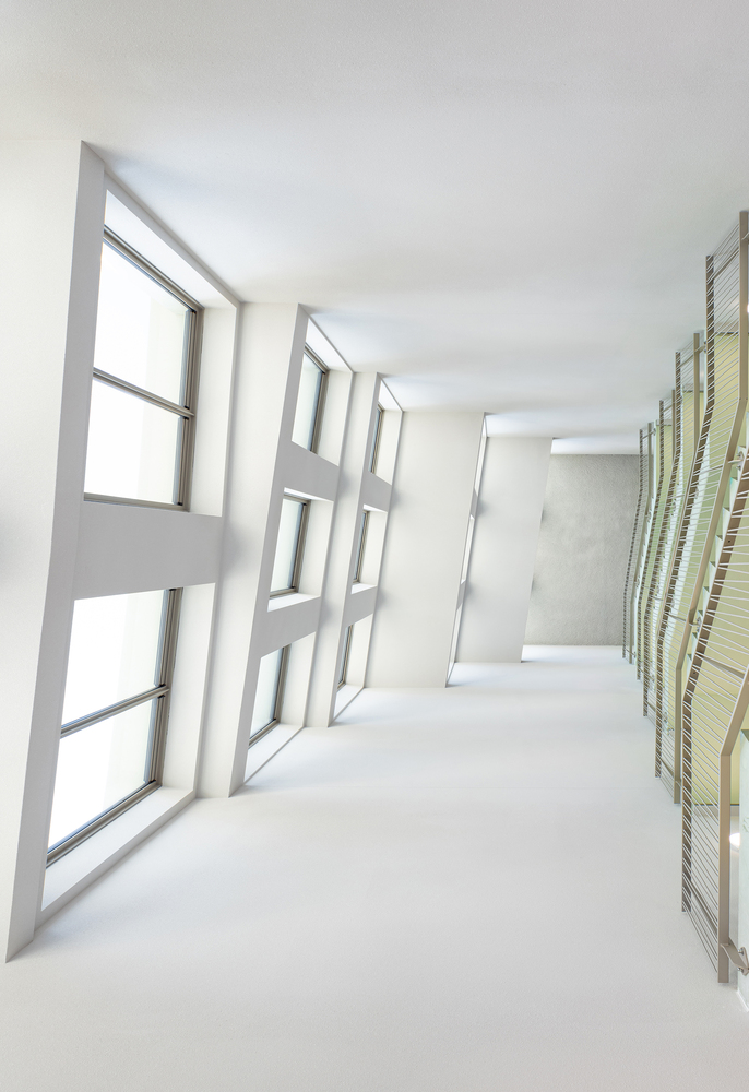
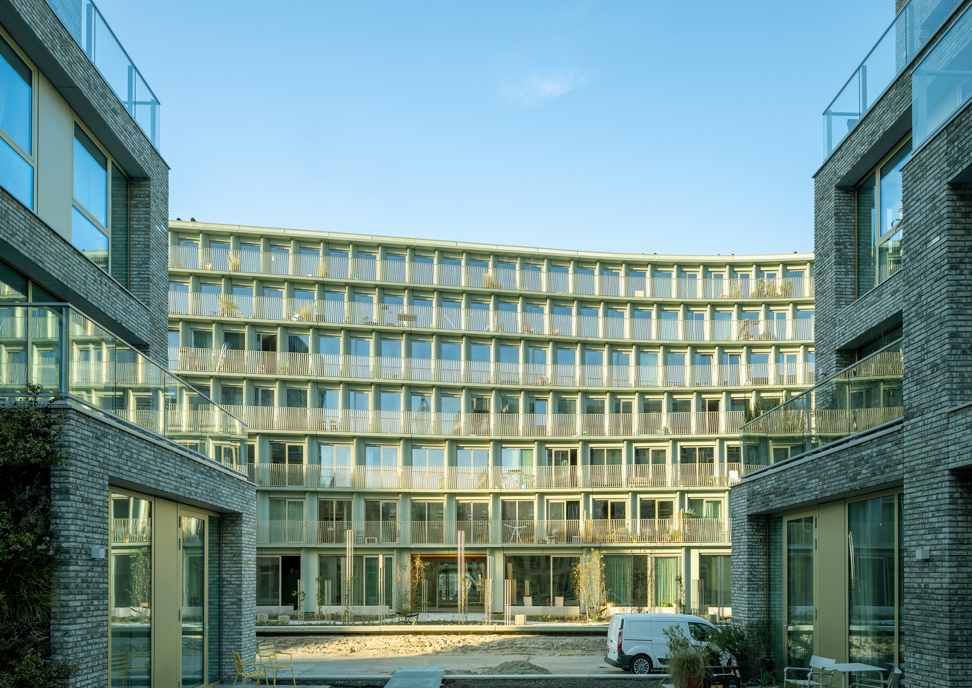
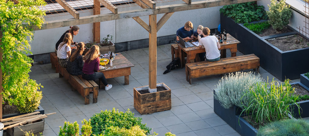
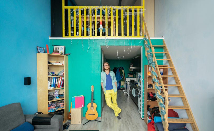
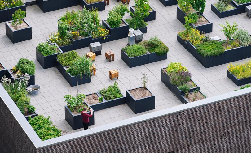
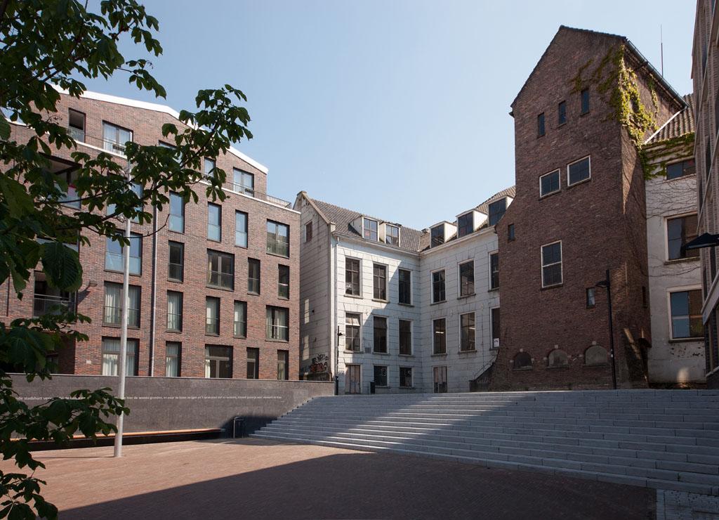
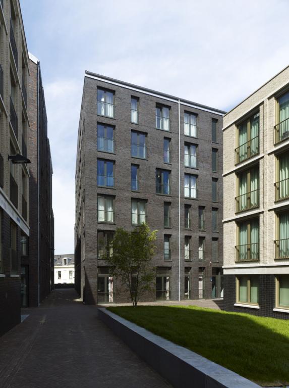
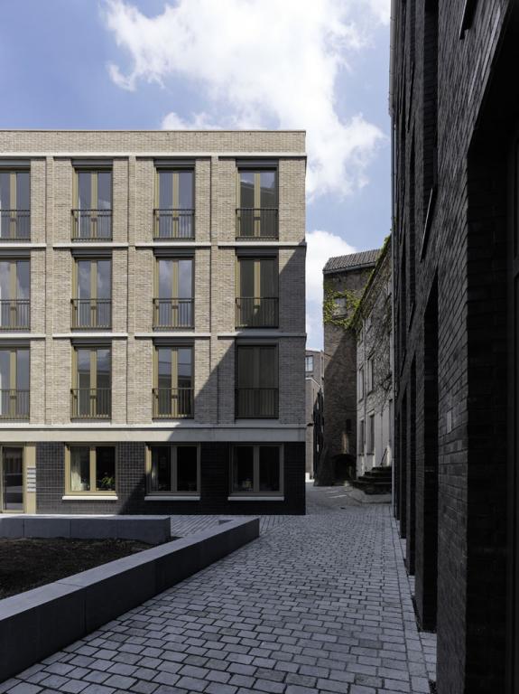
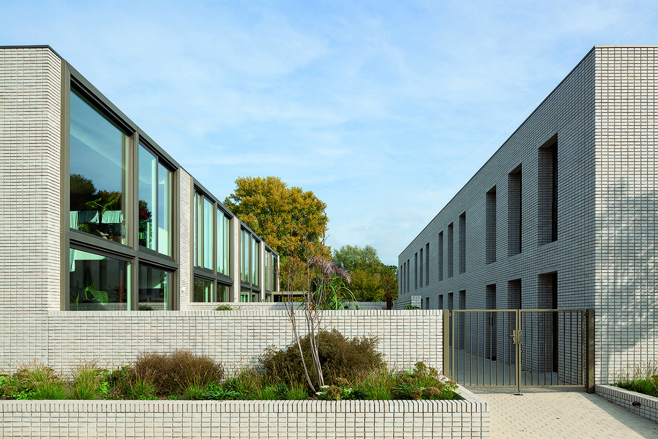
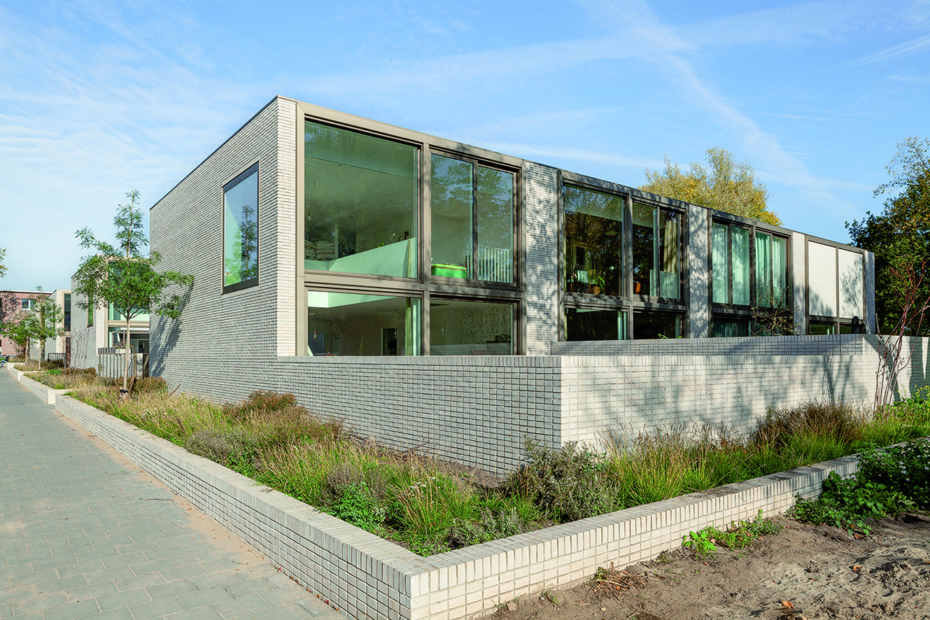
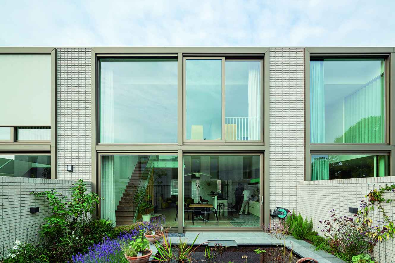
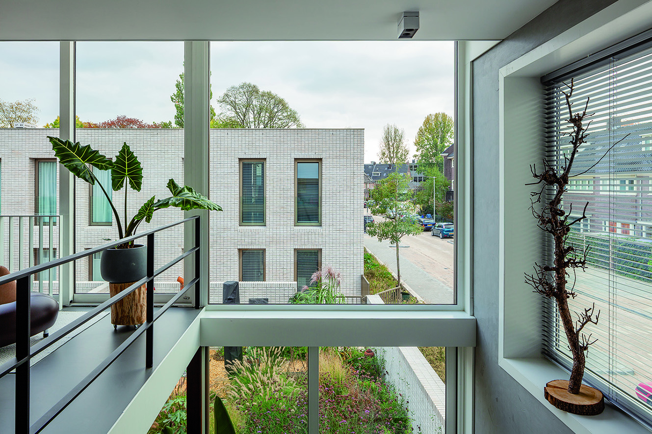
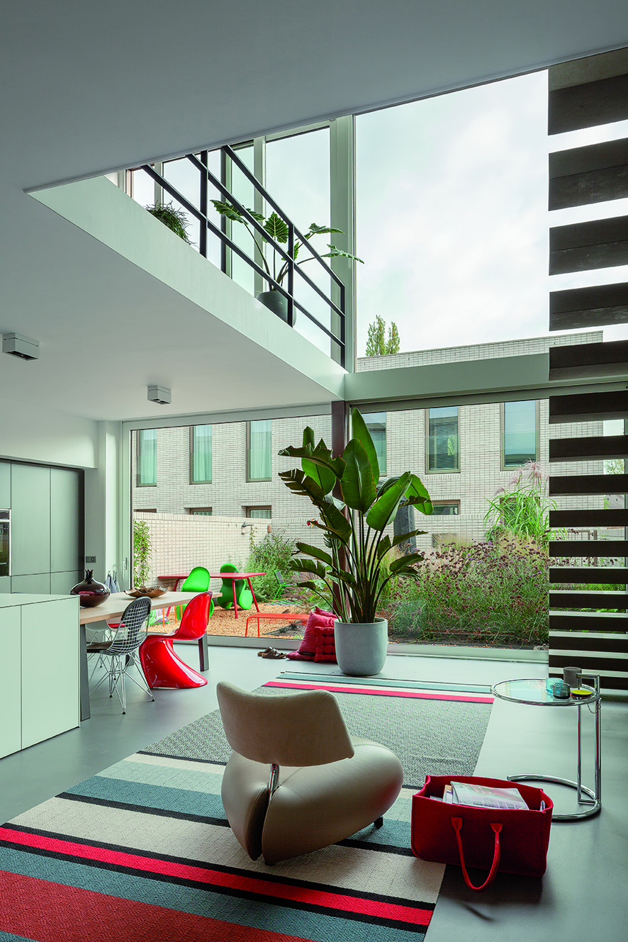
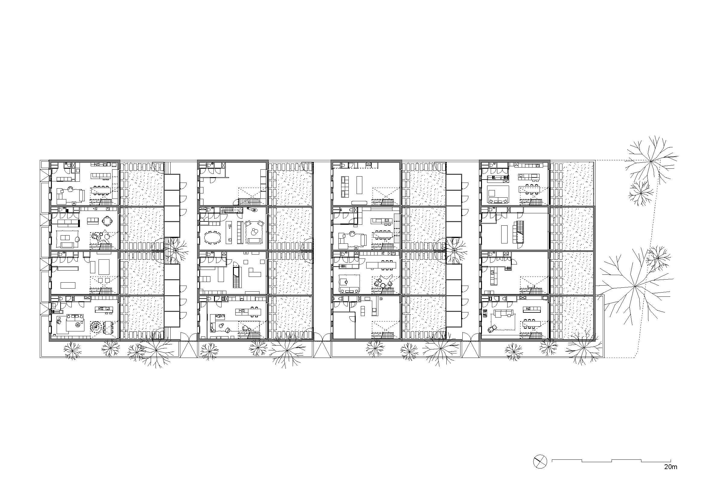
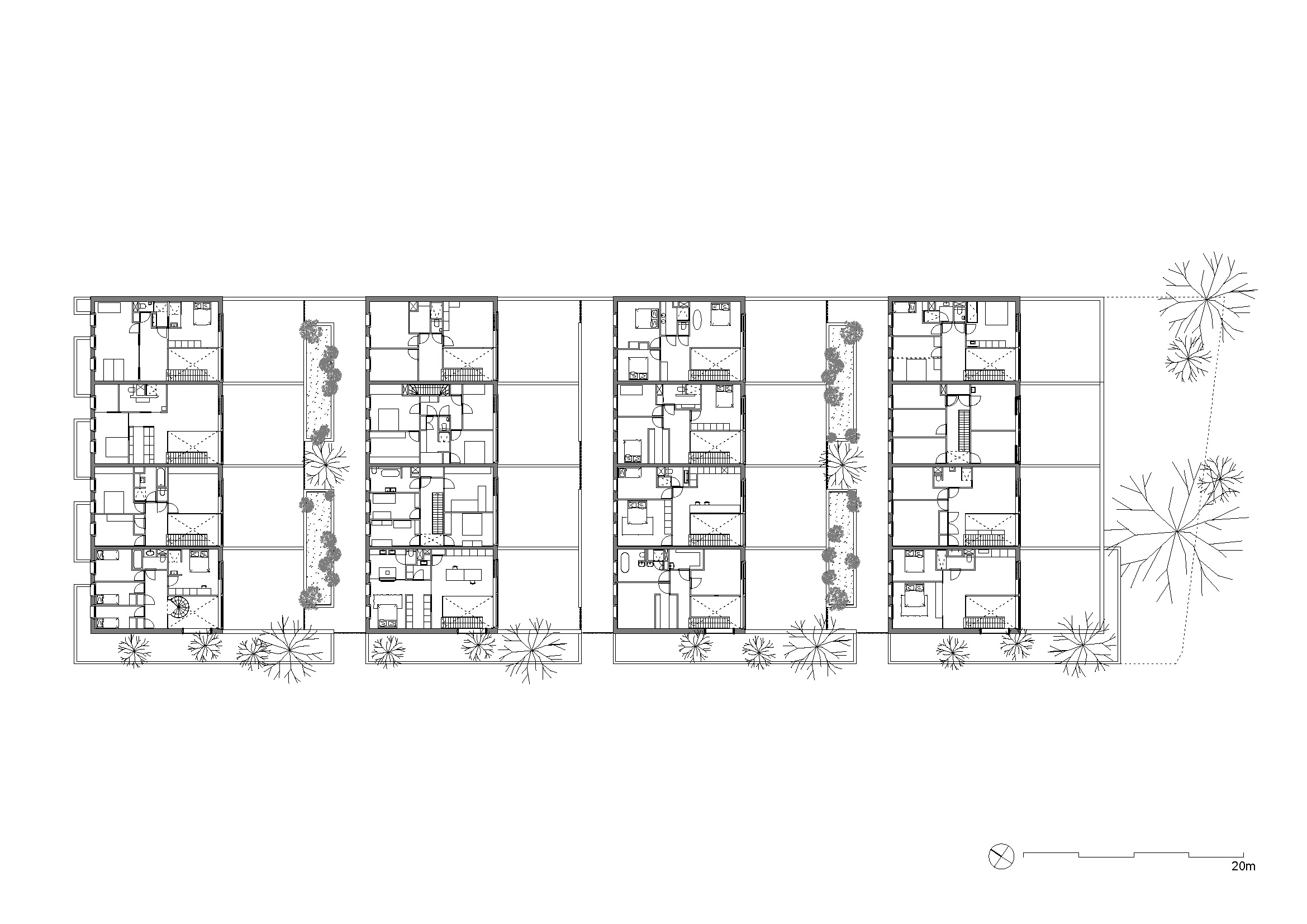
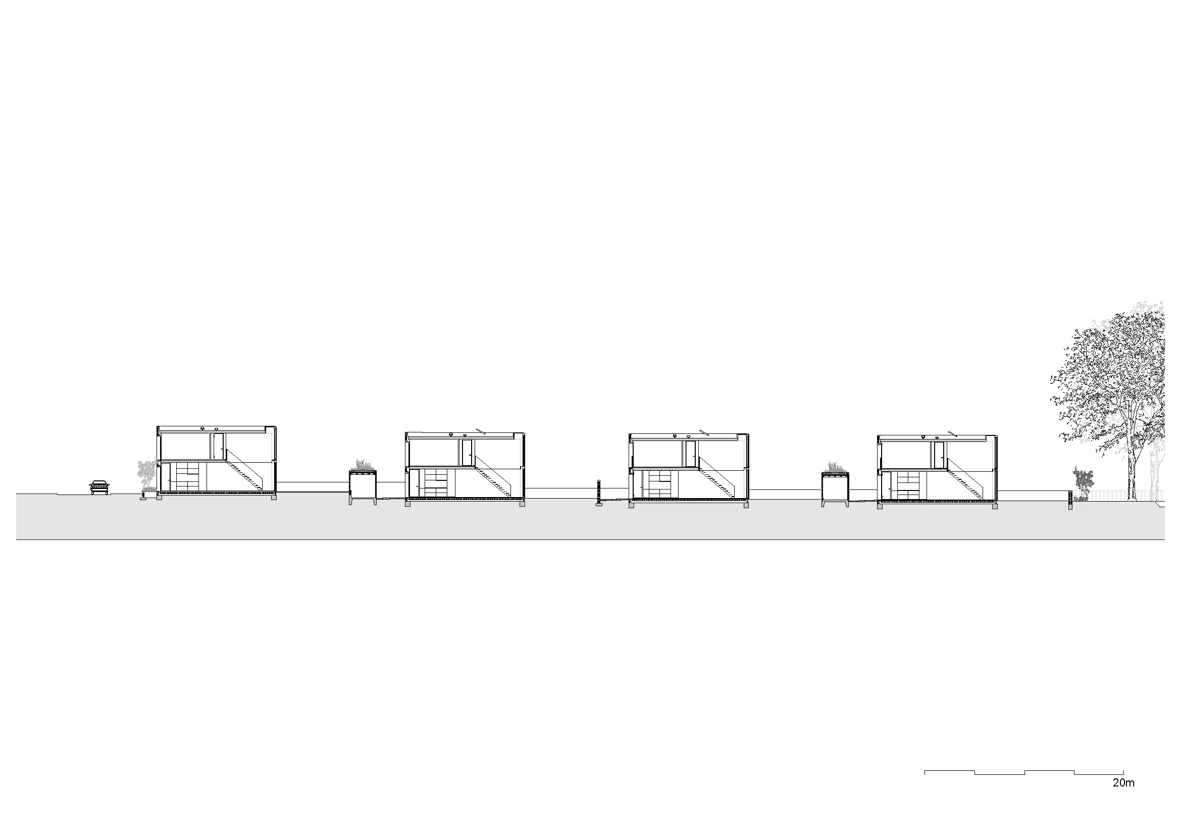
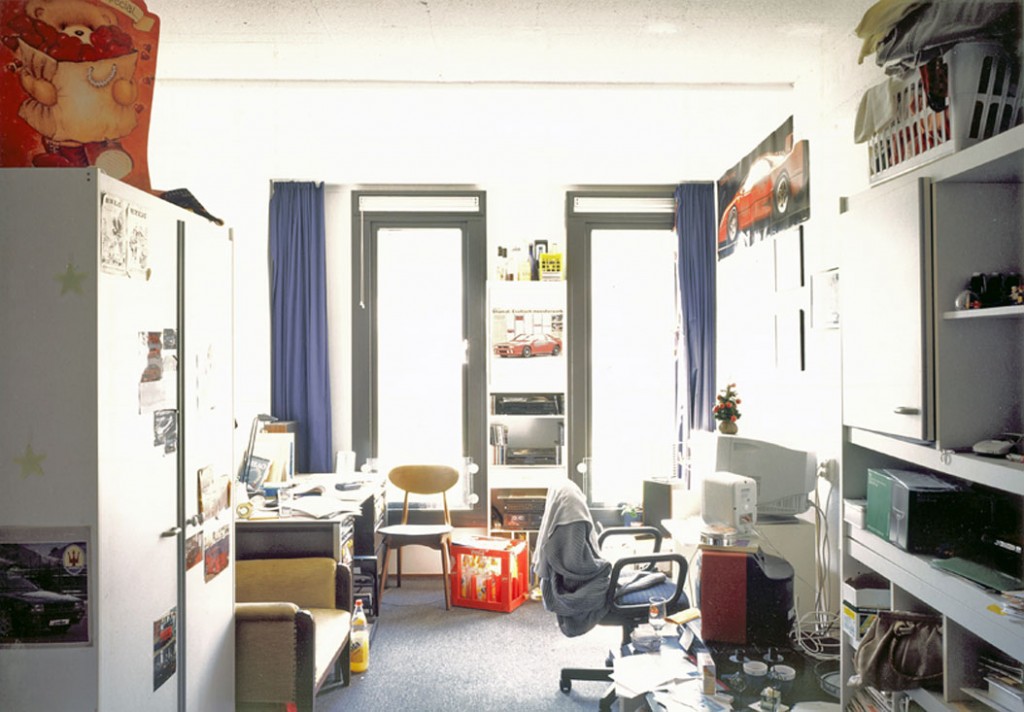
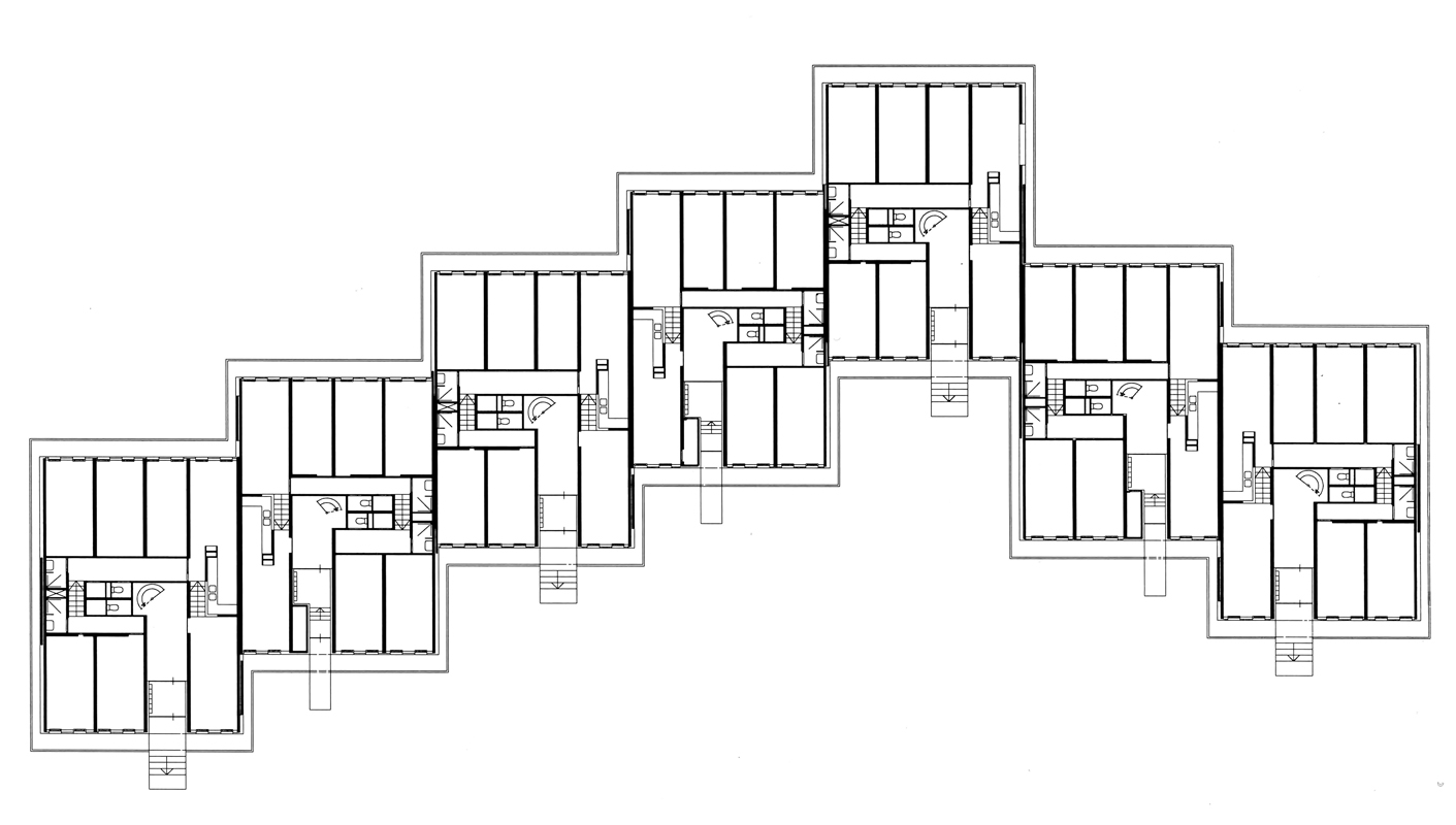
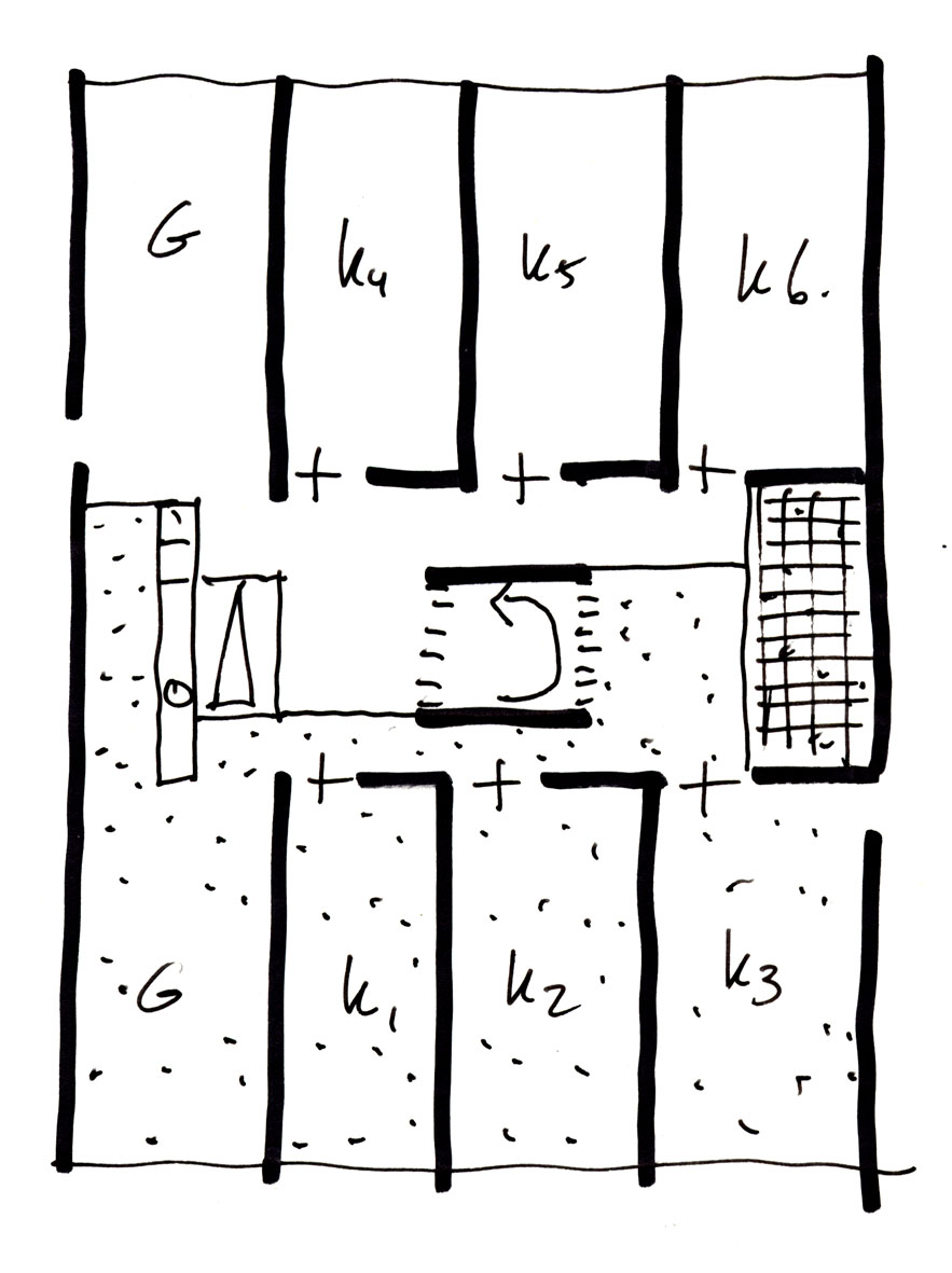
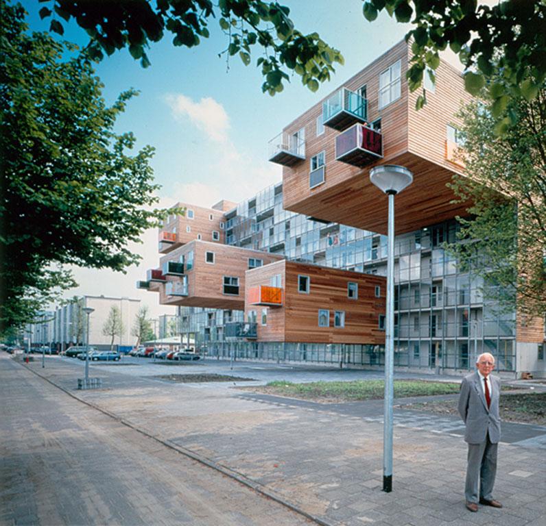
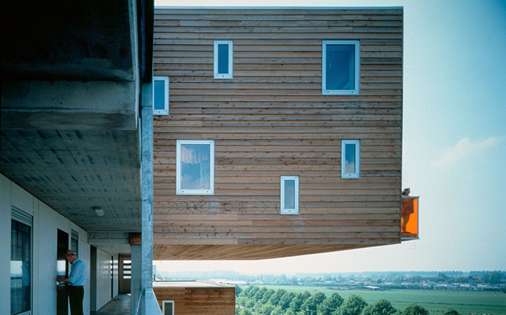
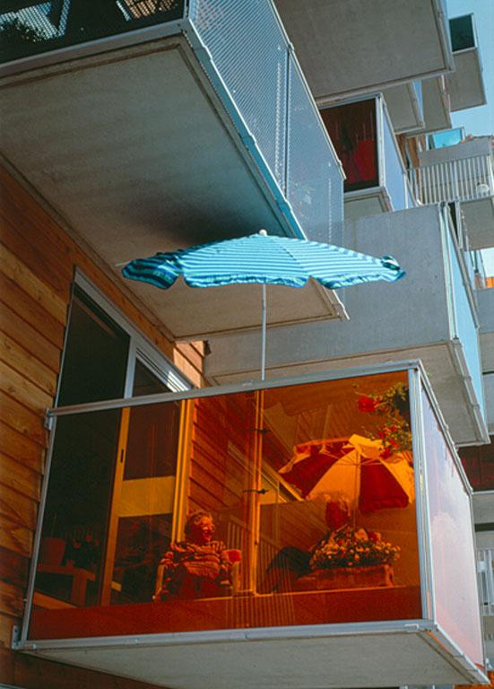
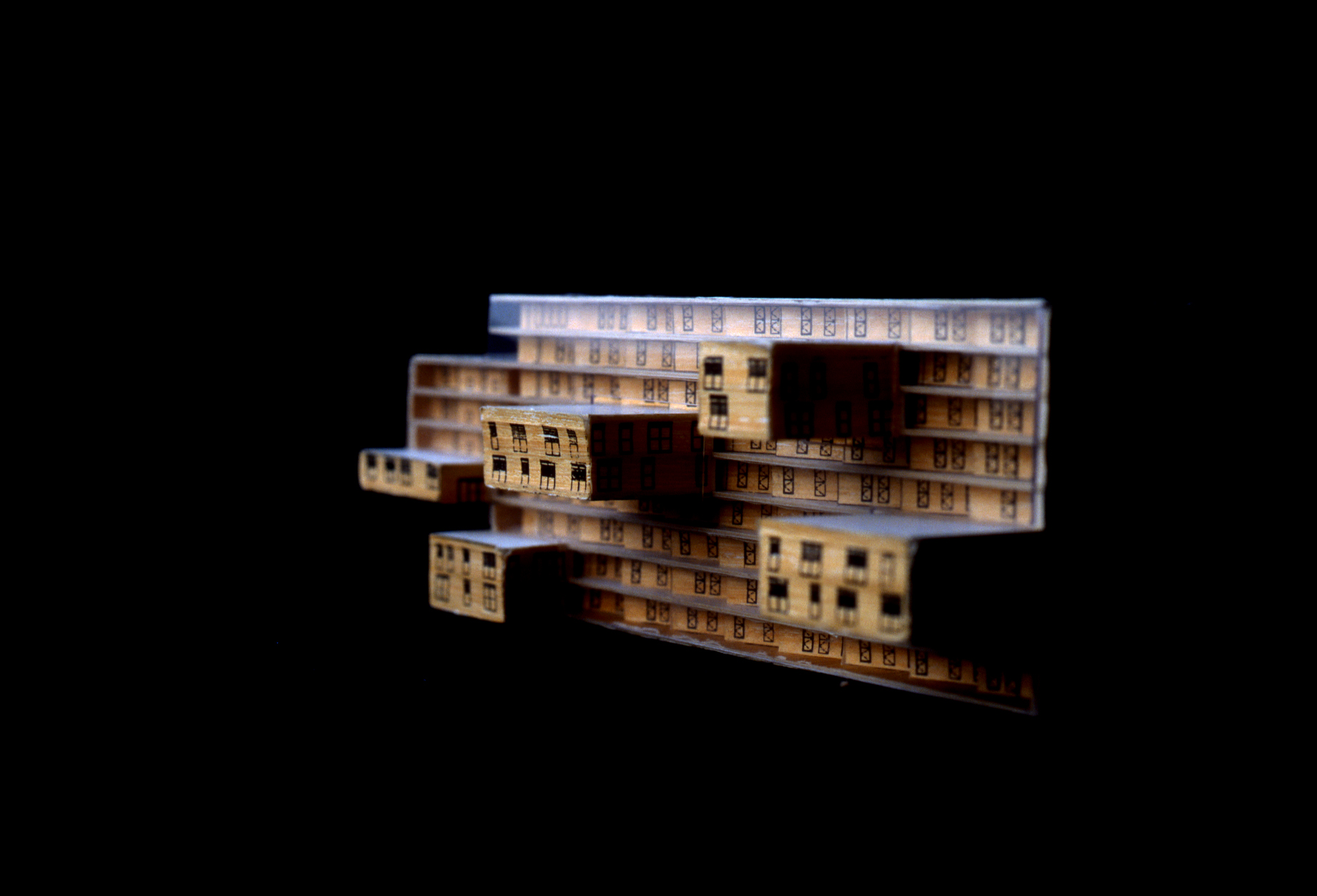
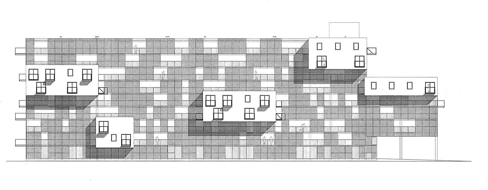
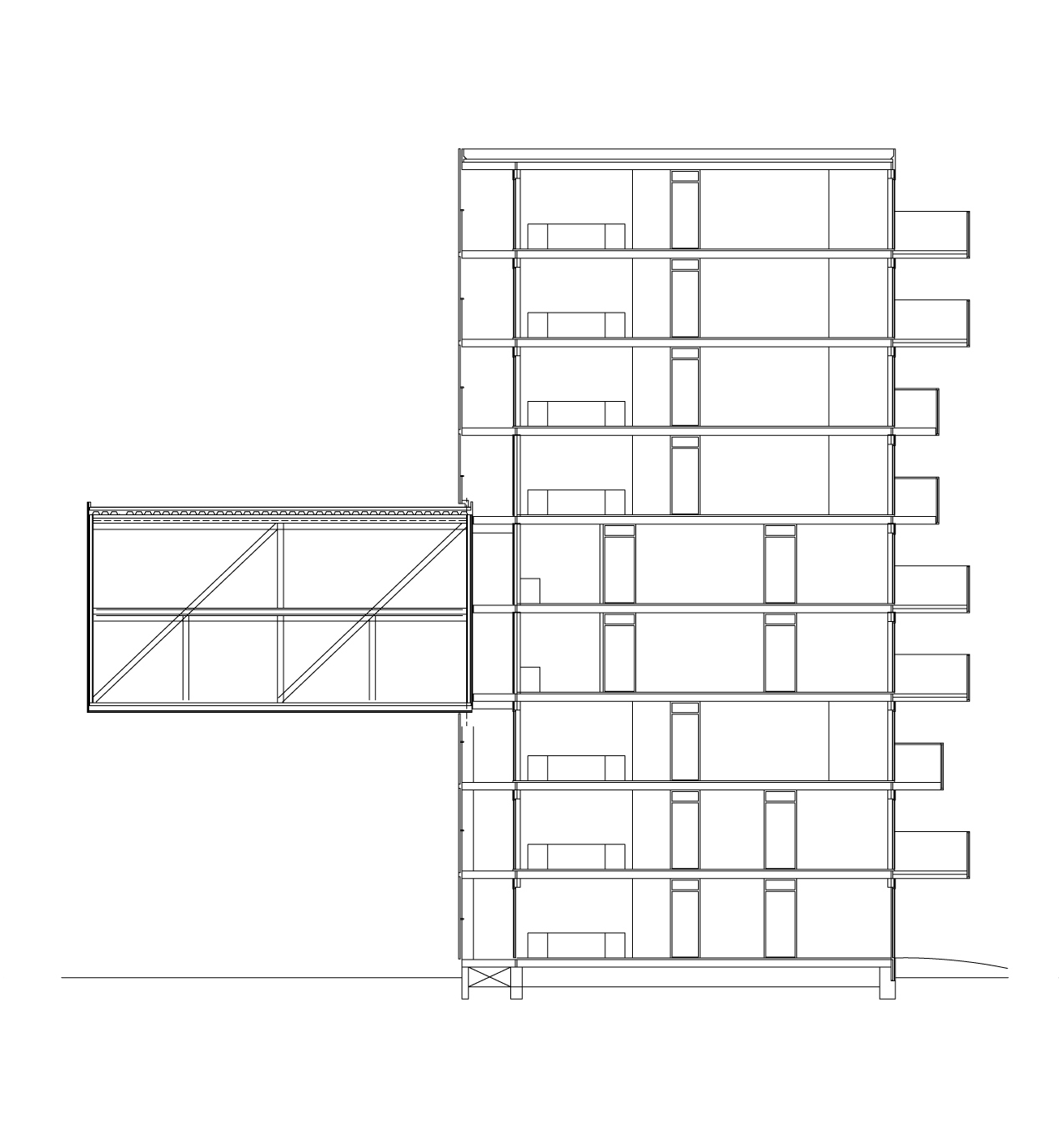
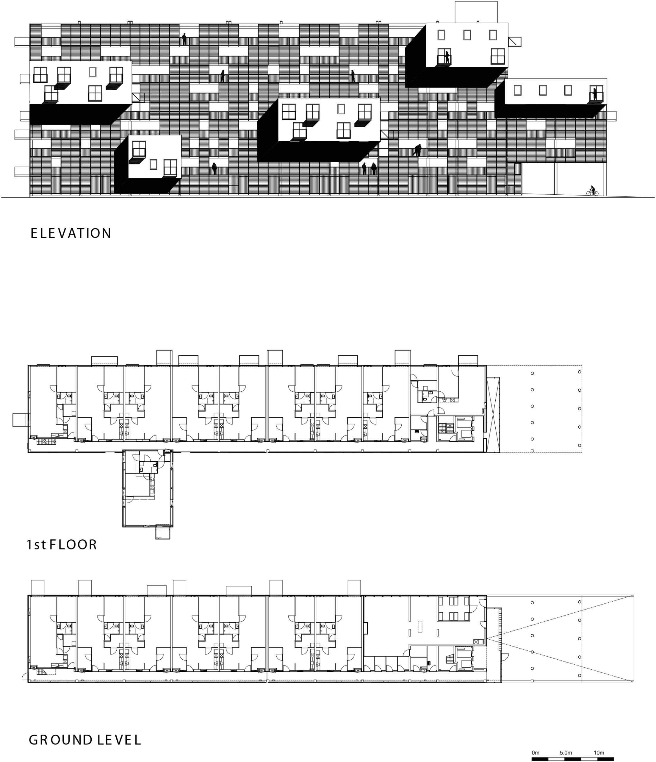
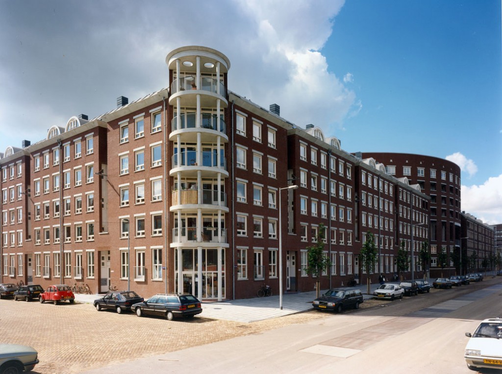
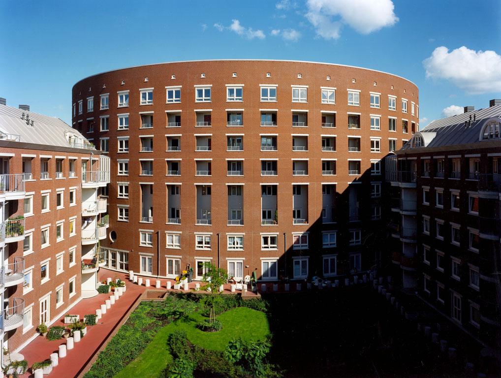
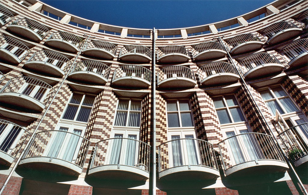
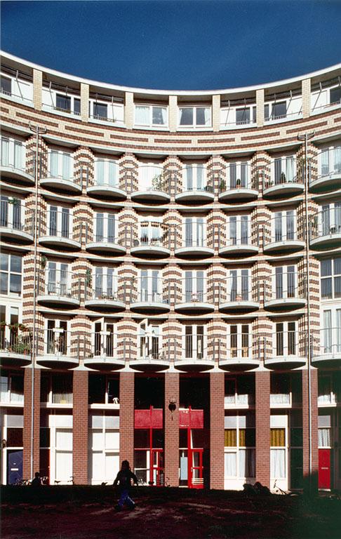
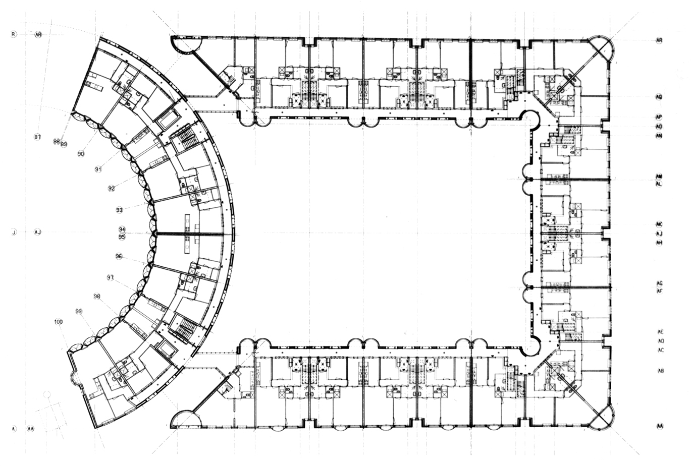
The result is Silodam. Today, the Silodam residential block, located on the river Ij in Amsterdam, houses 157 dwellings together with commercial premises, offices, workshops and collective spaces. The different uses are distributed over ten levels raised above the water by means of a structural grid of pillars and load-bearing walls, creating a compact block reminiscent of a large ship loaded with containers. The silo is located at the end of a dock where other factory buildings were also transformed into housing to bring urban density to this central area of the city. Collective spaces for neighbours, including a marina, a grandstand and a terrace overlooking the sea, take advantage of this privileged location. The Silodam offers a variety of housing typologies to create an intergenerational environment and better respond to market demand. Aiming to promote a mix of residents of different socio-economic and generational profiles, the Dutch studio designed fifteen types of housing that differ in size, organisation and price. Small flats, duplexes, courtyard houses and three-storey lofts are grouped in clusters of four to eight units, forming small neighbourhoods connected by a complex network of walkways, galleries and brightly coloured corridors.
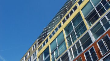
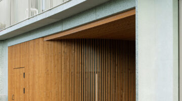
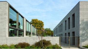
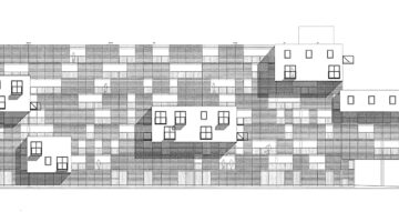
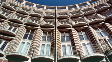
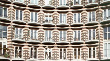
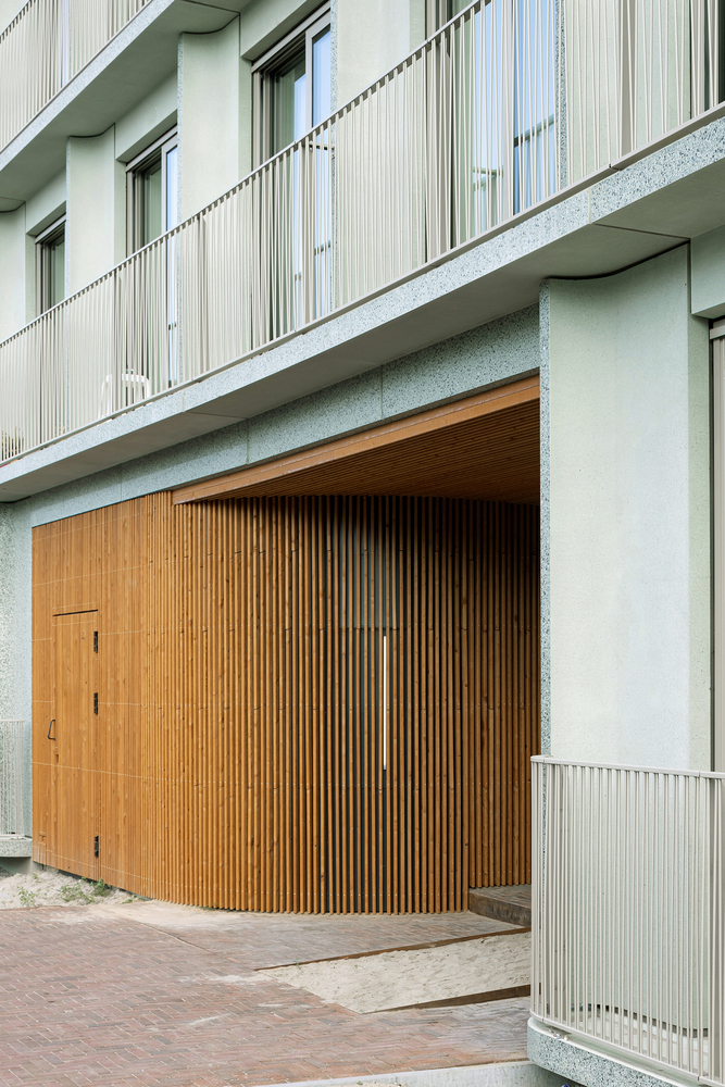
This typological organisation defines the building's exterior identity. Clearly inspired by the image of container ships sailing through the Dutch capital, the façade is a collage of colours, materials (corrugated iron, cedar wood and aluminium) and windows of different shapes, revealing the order of this colourful jigsaw puzzle. Internally, the block is divided into groups of four to eight dwellings, forming small units identified by the colour of their access and by a similar façade treatment - either corrugated iron, cedar wood or aluminium panels.
The ultimate goal was to create a mixed neighbourhood on the river. With uses such as restaurants, offices, housing... And with different attributions in terms of the panoramic views or building characteristics. Although it is not a social rental project, the variety of typologies makes it possible to balance costs and offer housing of varying affordability. In this way, accessibility is generated in a unique environment and in a building with multiple uses and possibilities.


