DeFlat Kleiburg
Main objectives of the project
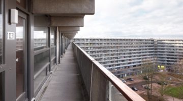
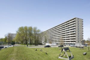
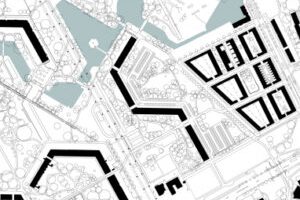
De Flat is a groundbreaking renovation of Kleiburg, one of the largest apartment buildings in the Netherlands. It consists of 500 apartments, spanning 400 meters in length and 10 + 1 stories high. Consortium De FLAT saved the building from demolition by transforming it into a Klusflat, where residents renovate their own apartments. Kleiburg is located in the Bijlmermeer, an Amsterdam residential expansion influenced by CIAM.
The renovation focused on preserving the main structure while leaving the apartments unfinished, creating a new housing business model in the Netherlands. Instead of individualizing and differentiating the building, the goal was to embrace unity and revitalize the entire structure. Concrete additions were removed, restoring the original horizontal balusters and opening up the facade. Sandblasting revealed the beauty of the pre-cast concrete balusters.
The storage spaces were relocated to each floor, freeing up the ground level for social activities and integrating the building with the surrounding park. Double-height connections were created to enhance scenic relationships. Energy-saving motion detectors were used for gallery illumination, allowing the individual apartments to shine.
Overall, De Flat showcases the intrinsic beauty of the building, emphasizing unity, and creating a unique housing concept.
Date
- 2016: Rehabilitación
Stakeholders
- Architect: XVW architectuur
- Architect: NL Architects
Location
City: Amsterdam
Country/Region: Amsterdam, Netherlands
Description
De Flat is an innovative renovation of one of the biggest apartment buildings in the NL called Kleiburg, a bend slab with 500 apartments, 400 meter long, 10 + 1 stories high. Consortium De FLAT rescued the building from the wracking ball by turning it into a Klusflat meaning that the inhabitants renovate their apartments by themselves. Kleiburg is located in the Bijlmermeer, a CIAM inspired residential expansion of Amsterdam.
A renewal operation started mid nineties. Many of the characteristic honeycomb slabs were replaced by suburban substance, by ‘normality’.
Kleiburg was the last building in the area still in its original state; in a way it is the “last man standing in the war on modernism”.
The idea is to renovate the main structure -elevators, galleries, installations- but to leave the apartments unfinished and unfurnished: no kitchen, no shower, no heating, no rooms. This minimizes the initial investments and as such creates a new business model for housing in the Netherlands.
Most attempts to renovate residential slabs in the Bijlmer had focused on differentiation. The objective: to get rid of the uniformity, to ‘humanize’ the architecture. By many, repetition was perceived as evil.
But after three decades of individualization, fragmentation, atomization it seems an attractive idea to actually strengthen unity: Revamp the Whole!
It is time to embrace what is already there, to reveal and emphasize the intrinsic beauty, to Sublimize! In the eighties three shafts had been added including extra elevators: they looked ‘original’ but they introduced disruptive verticality. It turned out that these concrete additions could be removed: the elevators could actually be placed inside the cores, the brutal beauty of the horizontal balusters could be restored.
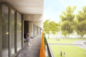
On the galleries the division between inside and outside was rather defensive: closed, not very welcoming. The closed parts of the facade were replaced with double glass. By opening-up the facade the ‘interface’ becomes a personal carrier of the identity of the inhabitants, even with curtains closed…
Sandblasting the painted balusters revealed the sensational softness of the pre-cast concrete: better than travertine!
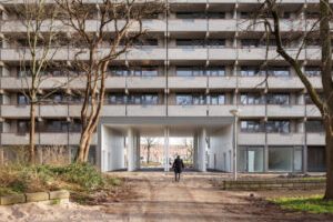
Originally the storage spaces for all the units were located on ground level. The impenetrable storerooms created a ‘dead zone’ at the foot of the building. By positioning the storage on each floor we could free up the ground floor for inhabitation, activating it to create a social base and embedding the ‘beast’ in the park.
More generous, double height connections between both sides of the building were formed creating scenic relationships.
Gallery illumination has a tendency to be very dominant in the perception of apartment buildings with single loaded access. The intensity of the lamps that light up the front doors on the open-air corridors overrules the glow of the individual units. The warm ‘bernstein’ radiance of the apartments is ‘obscured’ by a screen of cold lights. But what if the gallery lights worked with energy saving motion detectors? The individual units now define the appearance. Every passer-by a shooting star!
